Debra Prinzing

Get the Email Newsletter!

Archive for the ‘Plants’ Category

Meet the new generation of mums

Tuesday, November 23rd, 2010

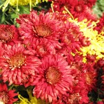
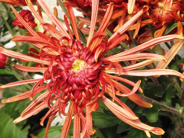
Seatons Toffee, a 'quill' form with deep bronze petals.

I have great memories of the giant yellow chrysanthemum corsage my dad bought me for a college homecoming when I was a little girl. That curly ball of petals was so unwieldy it was hard to keep from crushing it with my chin. To me, that mum didn’t even feel real – it was like something from a fantasy world of my dreams.

My relationship with mums hasn’t really changed much since then. I’ve always kept them at arm’s length, both in garden design and in floral arranging.

The only time mums registered on my radar in the past decade was the celebrated arrival of ‘Kermit’, a lime green mum with a button-like flower that gained a huge following for its zesty color and knack for looking good in a vase for up to two weeks. But what about other mums?

Lots to learn
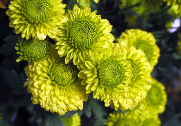
'Yoko Ono' is a top pompom-style mum with that awesome green hue.

Any ambivalence I’ve had about mums changed for the positive after I met two leading mum experts at the Association of Specialty Cut Flower Growers annual symposium in Tulsa, Oklahoma earlier this month.

On one of the long bus rides, I sat with Ray Gray of King’s Mums, an Oregon City, Ore.-based grower of “exhibition, specialty and vintage chrysanthemum rooted cuttings.”

Ray shared a bit of the story behind how he and his wife Kim purchased King’s Mums in 2008. The Grays are longtime wholesale nursery owners who were looking for ways to diversify their crops. They learned from Janet Foss, another grower, that King’s Mums was for sale.

'Yodogimi' is a semi-double mum with dark red petals tipped in gold.

For more than 40 years, the King family operated a huge Chrysanthemum-growing operation in Central California. The business served the amateur gardener and professional grower with more than 200 cultivars of exhibition and spray mums, one of the largest sources in the U.S.

After buying the business, Ray and Kim in January 2009 moved this amazing collection to their small family farm in Oregon City. They are carrying on the tradition begun by the Kings while also implementing new technologies and growing methods.
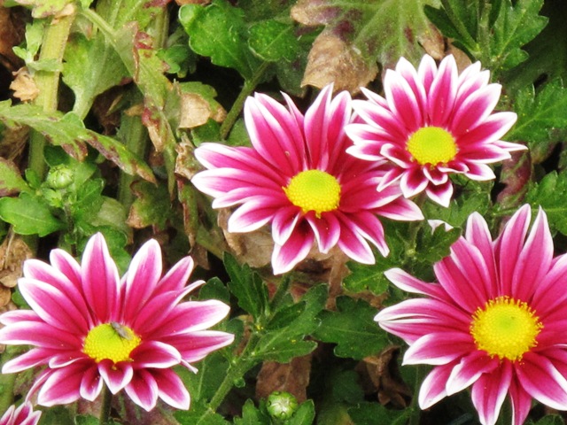
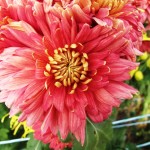
'Two Tone Pink' has petite pink-purple petals with white tips.

Ray gave me a copy of the King’s Mum catalog and right away I started drooling over the cultivars between the covers. As a cut flower choice, the mum is superb. The palette leans toward the warm end of the color spectrum, which is very en voguewith today’s floral designers: bronze, gold, terra cotta, salmon, champagne, orange, crimson, pink-red, lime green, apricot, burgundy, and all sorts of luscious bi-colored petal combinations. And of course, there are also pastel, cream and white flowers.
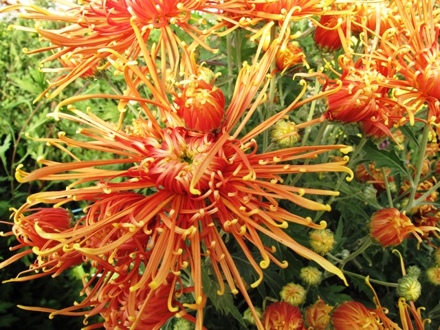
'Senkyo Kenshin' is a dark bronze 'spider' form - magical!

I know this is probably all old news to people in the National Chrysanthemum Society, and to specialty cut flower growers and their floral design clients. But I found it thrilling to meet Ray and learn how he and Kim are keeping alive this important cut flower category. Yes, I started to fantasize about growing some of these blooms in my own garden.

Note to self: King’s Mums is open to the public each October. Located about 20 minutes south of Portland (Oregon City is the end of the historic Oregon Trail), you can visit during business hours and see these yummy flowers up close and personal.

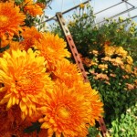
A beautiful punch of color comes from mums filling the hoop house at Bear Creek Farm.

There is another reason why mums stayed on my mind at the ASCFG conference. After meeting Ray and flipping through the beautiful flowers in his catalog, I was stunned to walk into one of Vicki Stamback’s hoop houses at Bear Creek Farms to discover rows of these very mums I’d just seen in that catalog.

I have to confess, I was a bit antisocial while skipping out of the demonstration of releasing beneficial insects in the greenhouse. But I wasn’t the only one climbing between the shoulder-high rows of mums, taking photos of these really superb blooms and making sure to jot down the name of each. These flowers were impossible to ignore as you can see here.

The following day, I sat in on “The Comeback of the Mum,” a presentation by Chehalis, Wash., grower Janet Foss. I learned enough to become a confirmed mum fanatic. You can read a summary of her presentation at A Fresh Bouquet.

I’ve got to share the rest of these incredible specimens:

A mini terrarium to hang from your tree boughs

Monday, November 22nd, 2010

Okay, I know that there is still one more week left in the month of November, but we had a big Seattle snowstorm today and so visions of sugarplums are dancing in my head.

One other reason I’m dreaming about my holiday decor is the just-arrived December issue of Better Homes & Gardens. It hit newsstands with a really gorgeous wreath on the cover and all sorts of design, entertaining and gift-giving ideas filling 275 beautiful pages.

A medium-sized glass "world" to gaze upon in wonder.

I was asked to pick my favorite garden gift for the holidays and you can read about it on page 153. Or you can see it here: An alluring “Forest Floor” ornament created by San Francisco designer Flora Grubb. It is a winner! Thanks to Flora for suggesting we feature one of her custom ornaments and for sharing the photograph you see here.

Living Ornaments:

It’s fun to use living elements and wild-gathered souvenirs from nature in your holiday decorating. I love this “Forest Floor” glass ornament created by San Francisco designer Flora Grubb. Lichens, moss, feathers and seeds cushion a living Tillandsia air plant inside a tiny glass ball – an enchanting, diminutive naturescape to hang from branch or bough.

An occasional spritz of water is all this tiny terrarium needs to continue looking beautiful – even after you take down the tree. Available from www.floragrubb.com; 3-inch, $19.95; 4-inch, $24.95; set of three 2-inch balls, $19.95.

Cool, huh?

Some good news for the print world:

For those of you who subscribe to the New York Times, you can’t have missed a full-page advertisement on the back of today’s Business section. It’s so huge that I couldn’t scan the entire contents of the colorful spread on my tiny printer. But here’s the gist of it:

Better Homes & Gardens, along with Meredith Corp. sister title Family Circle, are the magazine world’s #1 and #2 top books for women consumers, in terms of total advertising pages sold.

Under the leadership of editor-in-chief Gayle Goodson Butler and SVP, Group Publisher James T. Carr, Better Homes & Gardens has earned the support of 1,739 advertising pages this year. 

Just when everyone thinks magazines are a dying breed, here’s a report that “these magazines have held the top two positions in the women’s lifestyle category for 2010 and 2009.”

Just sayin’.

A tour of the Chartreuse House garden

Saturday, November 20th, 2010

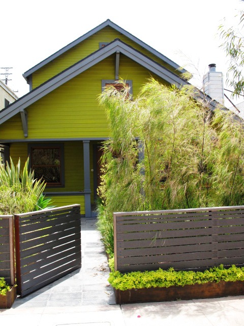
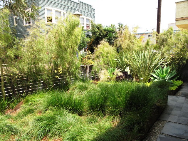
You can't miss the Chartreuse House, seen through the similarly-colored plant palette.

Today’s Los Angeles Times’ HOME section features my architecture/interiors story about Lisa Little and Phil Brennan’s makeover of a pair of tiny cottages in Venice, Calif.

The Venice-based architect and her special effects wizard husband painted the exterior an acid-chartreuse color and trimmed the house in charcoal gray.

Click on over to the story and you’ll see a fabulous web gallery of images shot by photographer Katie Falkenberg.

I also included a sidebar on Stephanie Bartron’s amazing work in the postage stamp-sized front yard, which faces a Venice walk street, which appears in LA at Home, the Home section’s daily design blog.

But you really can’t see much of the garden in the Times’ web gallery.
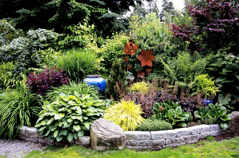
I promise you – it’s something to behold, featuring a dazzling palette of plants that enliven the small entry garden and play beautifully with the rugged materials Stephanie selected.

So I will share those photos here, along with the sidebar text:

A Chartreuse garden

As a color-packed accent to the renovated 1905 Craftsman bungalow, the Chartreuse House’s front yard is a example of how much great design can occur in a tiny patch of soil.

Yet before choosing a zesty palette of drought- and salt-tolerant plantings, designer Stephanie Bartron, of SB Garden Design, had to address some of the less visible challenges of the property’s postage stamp-sized entry. Prior owners had piled layers of topsoil over the sandy native soil, which created a drainage mess.

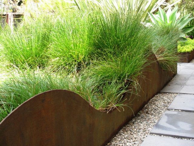
A wave-like pattern gives lots more interest to the raised bed.

“I needed to lower the grade of the front yard in order to move water away from the house,” Bartron says. “We calculated the volume of soil to excavate and used that amount to fill two raised planters. That way we didn’t have to haul away any material.”

Divided by a permeable walkway of concrete tile, the raised planters are formed by boxes of thick steel plate that have been roughly finished to encourage rusting. Now weathered, the boxed-beds replicate the Cor-Ten steel used to make the vertical planter in Little and Brennan’s courtyard.

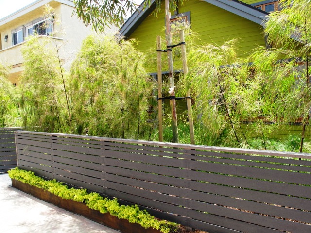
The same weathered steel forms a slender raised planter at the base of the charcoal fence facing the walk-street. It is filled with a ribbon of golden oregano and Sedum rupestre ‘Angelina’ — which dazzle against the darker fencing.

The chartreuse scheme continues outside the gray composite fence.

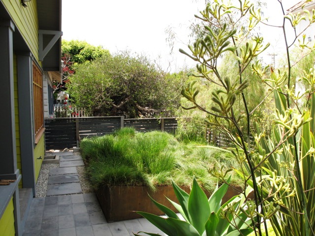
Bartron asked the metal fabricator cut a “wave” detail along the top of the larger planting box and in it she installed a sedge meadow, a nod to the nearby beach.  Privacy screening comes from a “hedge” of weeping Mexican bamboo and alternating chartreuse and yellow-flowering kangaroo paws.

“The plants create a punch of color in  such a small space,” Bartron says. The lacy bamboo fronds, the tall kangaroo paw stalks and the undulating drifts of sedge are constantly moving, thanks to the ocean breezes. Little added a eucalyptus tree to the front area, situated so that it will eventually grow high enough to screen the house’s topmost windows.

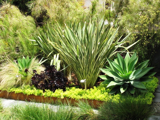
Such a simple yet sophisticated combination of plants in the smaller of two raised beds.

For the smaller of the two planter boxes, Barton paired dramatic clumps of smooth agave (Agave attenuata), known for growing well near the ocean, with Mexican feather grasses, dark purple Aeonium arboreum ‘Zwartkop’ and yellow-and-green variegated New Zealand flaxes. The entire bed is under-planted with the chartreuse Sedum rupestre ‘Angelina’. Filled with detail, it is a diminutive landscape that causes visitors to slow down and experience while approaching the front door.

The garden has many sustainable features, including low-maintenance plantings and permeable surfaces. Yet, says Bartron, its main design motivation is a response to the architecture. “This is such an artsy, whimsical place and I see the garden as a colorful jewel box for Lisa and Paul to enjoy.”

–Debra Prinzing

I’ll close with just a few more photos:

The larger of the two raised beds is planted mostly with Carex, to emulate the waves of the nearby Pacific Ocean.

This view shows how the Mexican bamboo and the kangaroo paws provide ample screening from the walk street traffic.

Playful and suitable for the setting, the lemon yellow kangaroo paw sways in the breezes.

Sunday in the park with Debra

Saturday, November 6th, 2010

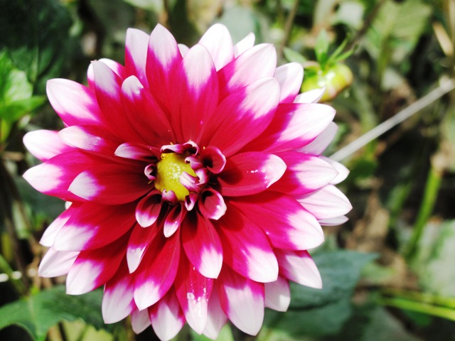
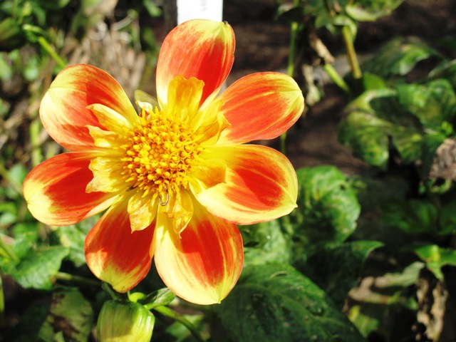
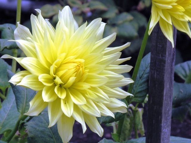
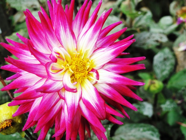
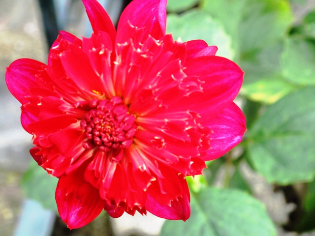
Dahlia 'Duo'

Last Sunday morning, while staying a few extra days in San Francisco after my Garden Conservancy talk, I took two Muni buses (47 & 5) to Golden Gate Park where all things artistic, botanical and cultural seem to reside.

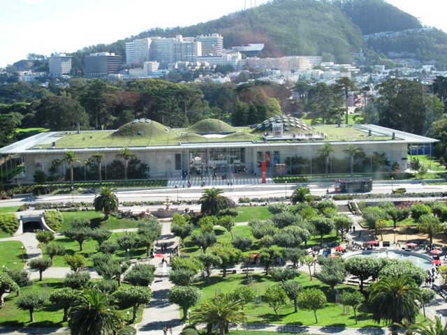
My objective was to see the amazing living roof at the California Academy of Sciences, but once I realized I only had 90 minutes, my plans took a slight detour. Art and flowers beckoned.

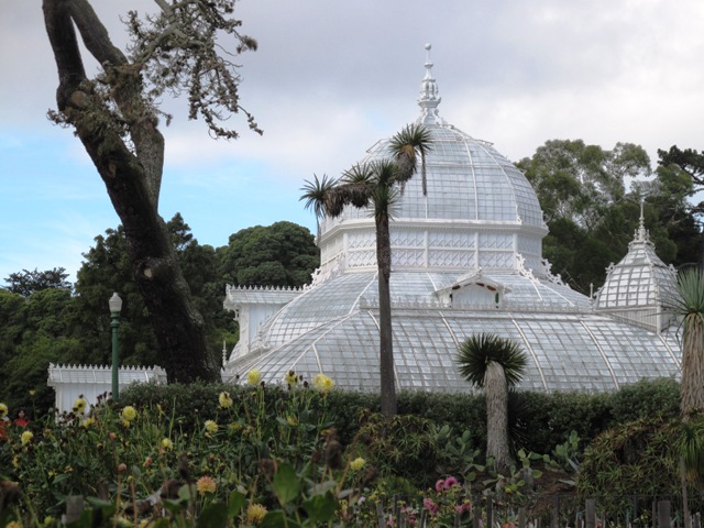
The Conservatory of Flowers, with Dahlia Dell in the foreground

First stop was the Conservatory of Flowers, circa 1879. It is one of the last remaining Victorian-era conservatories on the West coast (the other resides in Seattle’s Volunteer Park). Before I could even approach the conservatory, my attention was diverted by a late autumn display of dahlias.

Called “Dahlia Dell” and dating to 1924, two demonstration flower beds thrive here, located to the east of the conservatory. They are maintained by volunteers from the San Francisco Dahlia Society for the simple purpose of educating local gardeners and flower lovers about the diversity of dahlia color, form, size and culture. I have a feeling that Paula Jaffe, a dahlia expert and educator who I profiled in “Dazzling Dahlias,” a 2008 Perennials magazine article, is one of the passionate individuals responsible for this joy-inducing floral display.

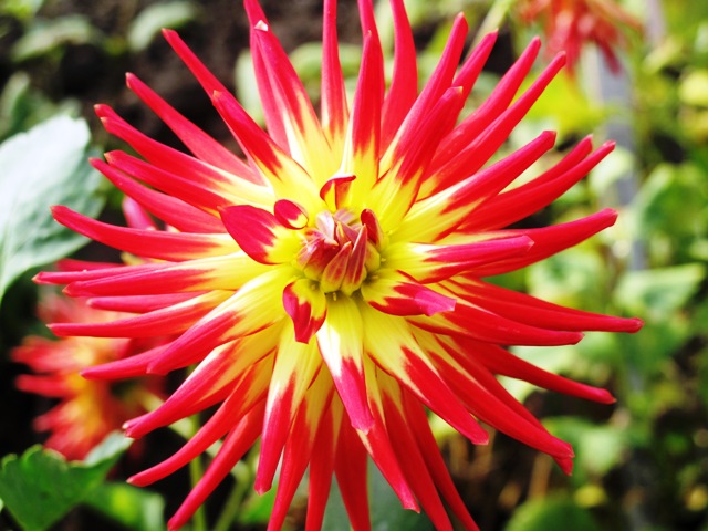
It was fun to play around with the “tulip” Macro button on the back of my Canon G10 camera and take pics of the fading beauties. These dahlias have withstood the combination of late-season rain, fog and sunshine and they’re still producing pretty blooms. I can’t wait to grow dahlias again, especially because they play well with flower vases. Really well. Enjoy this diverse display. Most (but not all) of the plants were labeled, thankfully.

Dahlia 'Western Spanish Dancer'

Dahlia 'The Phantom'

Dahlia 'Sir Richard'

Dahlia 'Shipley Spot'

Dahlia 'Shea's Rainbow'

Aptly named: Dahlia 'Pooh'

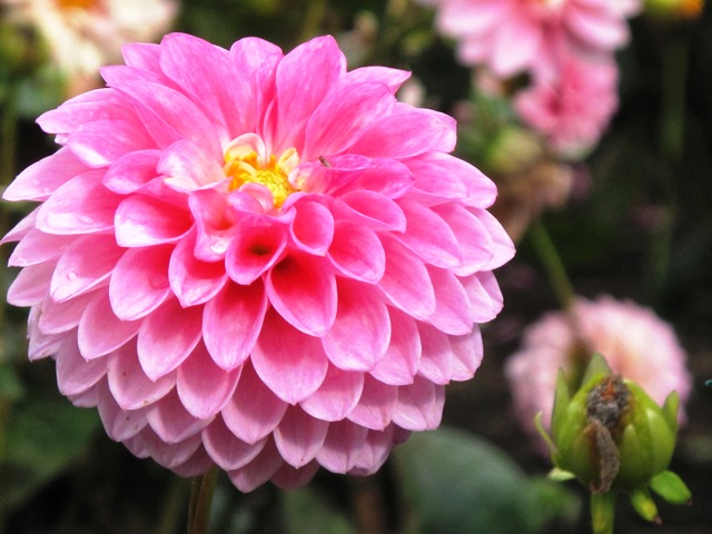
Dahlia 'Pink Paradise'

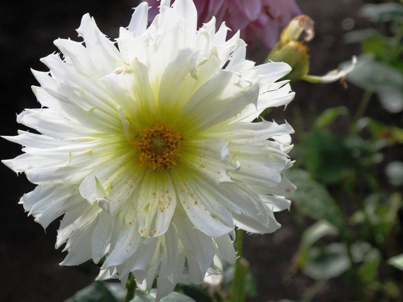
Dahlia 'Horse Feathers'

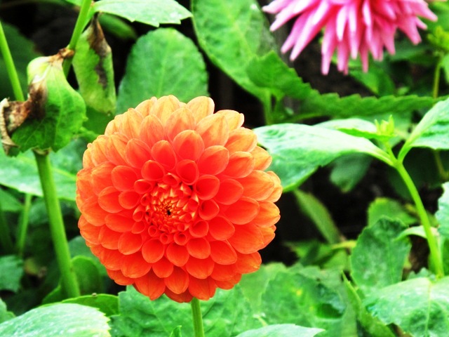
Dahlia 'Green D'Or' orange sport

Dahlia 'George C'

Dahlia 'Elvira' (a miniature)

Dahlia 'Delta Red'

Dahlia 'Creamy Beige'

Dahlia 'Bo De O'

Dahlia 'Belle Fiore'

Dahlia 'Badger Twinkle'

Dahlia 'Arulen Princess'

MORE TO SEE

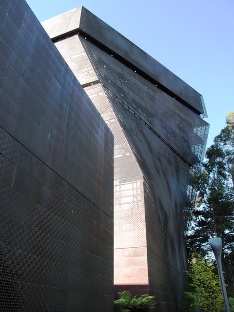
The de Young's tower - against a blue autumn sky.

After spending an hour with the dahlias, I moseyed over to the California Academy of Sciences, but discovered that – from ground level – it is nearly impossible to see, let alone get a sense of its scale and magnificence, Renzo Piano’s green living roof.

So I compromised and spent my museum admission budget to enterthe de Young art museum where “Van Gogh, Gauguin, Cezanne and Beyond: Post-Impressionist Masterpieces from the Musee d’Orsay” was in full swing. It was exciting to see the many amazing and exciting canvasses on display. I’ve been to the Musee d’Orsay twice before when in Paris and so I enjoyed revisiting some of the paintings and drawings again. Twelve galleries of paintings were incredible to take in. You can never have too much of this artwork. The show continues through January 18, 2011.

Here's a closer look at the pointillistic-style perforated copper exterior.

After I left the galleries, I took the elevator to the viewing tower.

Actually, this was the first time I’ve been to the de Young since it was renovated and reopened in October 2005. The “new” building is clad in a perforated copper sheath, which may sound rigid but has a sensual fluidity that reacts to the light and dark.

Depending on how the sun moves through the sky, the building’s surface has dot-like patterns and a shimmery quality. The 144-foot tower is one of the most alluring aspects of the new design, by Swiss architecture firm Herzog & de Meuron and Fong & Chan Architects in San Francisco. From way up high, you can see the best of San Francisco – a 360-degree, mind-blowing perspective.

This roof is incredible - a horticultural masterpiece on top of the California Academy of Sciences in SF

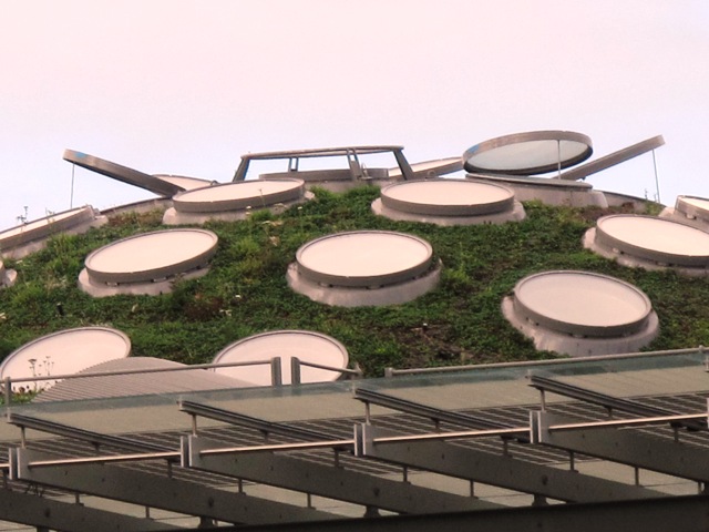
A closer look of one of the roof's mounded forms

From here, I got some photographs of that green, living roof.

 I’ve already decided that on my next visit to San Francisco, I will have to see that installation up close and personal. Because while peering down on it and photographing it (through the glass-walled viewing gallery), I noticed that people were up on the roof doing just that.

Not a bad lineup for a few hours at Golden Gate Park, huh?

Fall design inspiration: foliage, flowers, fruit and architecture

Monday, November 1st, 2010

“It would be worthwhile having a cultivated garden

if only to see what Autumn does to it.”

–Alfred Austin, The Garden that I Love (1894)

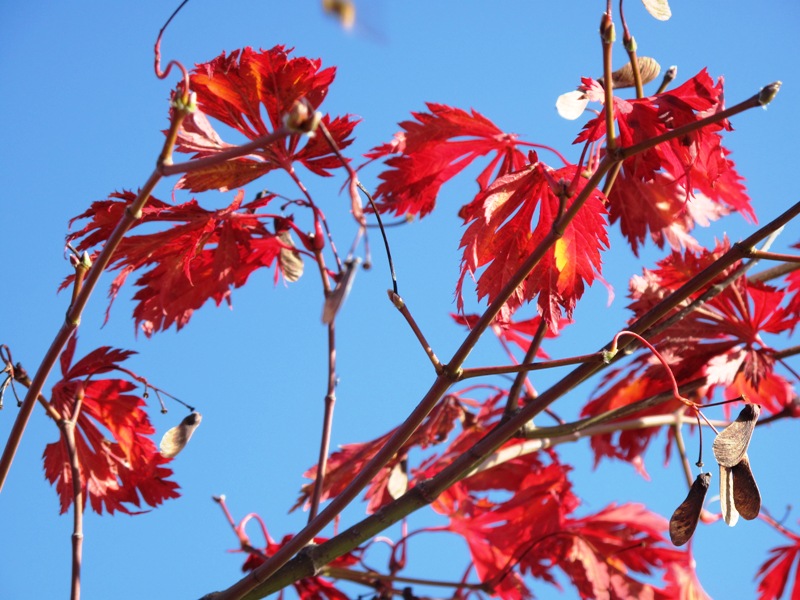
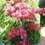
Acer japonicum 'Aconitifolium'

Whether emulating what you see in nature or combining plants to masterful heights, gardens that excel in the fall are ones that showcase the best of the season. 

There are certain trees, shrubs, perennials, ground-covers and vines that you may not notice during the rest of the year. But somehow, once the temperatures cool and the sun’s arc lowers in the sky (lighting foliage and plant forms from the side, rather than from overhead), a fall glow illuminates – and we see the garden in a new way.  

Last Friday I gave a presentation entitled “Gardens that excel in the fall: Something for everyone” at the Garden Conservancy’s one-day seminar in the San Francisco Bay Area. Called Fourth Quarter Gardens: An August to December Romance, the symposium featured several really inspiring speakers on design, horticulture and the unique gardening culture of the west. 

I was thrilled to be part of this cohort, which included Bob Perry, Katherine Greenberg, Nicholas Staddon, Elizabeth Murray, Chris Jacobson and Brian Kemble. The highlight for me was a tour of Katherine Greenberg’s all-native garden in Lafayette (an East Bay community). It was the three-dimensional, living embodiment of her lecture “Greens, Grays and Golds in a Native Garden.” 

My talk was a visual meditation of what inspires me this time of year: foliage, flowers, fruit and architecture in the landscape. 

I started by sharing the excitement I feel about the season as I design for texture in a new way; find unexpected plant pairings (not just those Halloween hues, either); tend to the harvest and see the bones, lines and structure emerge as leaves fall and flowers fade. My attention is drawn to the aging beauty of what some may call “decay.” Yet those yellowing hosta leaves and nearly-bare branches are a sign to me that the garden in every phase of growth is to be celebrated. 

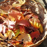
This lovely melange shows the amazing diversity of fall leaf color.

I also shared a lay-person’s explanation of why leaves change color in the fall. I quoted from Brian Capon’s book Plant Survival. 

“. . . the cool night temperatures and shorter days of September and October are sure to start the season’s normal color changes in leaves and . . . trigger their falling from the trees. 

“Leaves change color when the green pigment, chlorophyll, decomposes in leaf cells to reveal orange and yellow pigments, present all summer but hidden from sight by the more abundant chlorophyll. 

“In some trees, the unmasking of the yellow-orange pigments is accompanied by production of brilliant red ones, made from sugars and other substances in the leaves. The purpose of this last-minute display of added color is not known.  

“In the green leaf, both green chlorophyll and yellow-orange carotenoid pigments are contained in tiny chloroplasts. Because there is more chlorophyll than carotenoid, the leaves appear green. In fall, after the chlorophyll decomposes, only carotenoides remain to give the leaf its glowing, golden color. In some plants, the leaf cells produce red pigments, anthocyanins, that are stored in the vacuoles. As the anthocyanins collect and mask the carotenoids, the leaf turns red.” 

A lot has been written about fall gardening and much of it focuses on the importance that gardeners in the west do fall planting! 

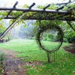
Witch hazel is espaliered along a lattice arbor at the Center for Urban Horticulture in Seattle.

I embrace and endorse this strategy, since it accomplishes so much that one may not have energy to tackle six months hence. It gets us out into nurseries and weekend plant sales, heightening our sensory response to a plant’s autumn form and texture and its promise of spring to come. The season forces us down on our knees to plan, prepare and place those treasures, brought home with the admonition (at least in the Pacific Northwest) to “plant before frost.” California gardeners want to plant in the fall for an entirely different reason — to capture any winter precipitation for good root establishment. 

If only to think about springtime, I will plant peony crowns in the fall. But then, I pause and remember what occurs after the blowsy bloom of Mother’s Day; and the sultry autumn glory of peony foliage comes to mind. Appreciating both the youth of spring and the maturity of fall is one of those wonderful surprises that comes from having plant lust. 

If you, too, are a fall-planting advocate, then what may be second-most on your mind is the design of an autumn landscape. 

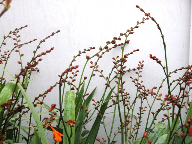
I love the architectural form of "spent" crocosmia blooms. These seed-heads are as beautiful as the flowers themselves.

Seasonal changes, at least at the beginning of the fourth quarter, work their magic here in the west. The light changes, the moisture content heightens, and the foliage reddens. The garden’s edges soften in some places (perennials go to seed; grass plumes explode; greens turn tan) and become more acute in other places (the architecture of deciduous plants is more pronounced; evergreen plants move to the foreground; anything that blooms is undoubtedly noticed as well). 

It’s almost as if the feminine personality of spring and summer steps aside for the more masculine personality of fall. Yet when I posed this theory to my friend Betsy Flack, she argued that “I’ve always thought (fall) was my own season—sort of the ample-bosomed (billowy) matron . . . after Spring’s sprite.” 

Our differing opinions reveal that the autumn garden is one we can all embrace. 

To me, there are four aspects to the 4th quarter garden that I consider when planning, touring and evaluating the well-designed landscape: 

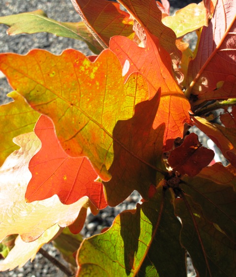
This is some kind of wild-looking oak, isn't it?

Foliage: 

Cooling temperatures and shortening days bring out the fall glow we so admire. Yet it’s not just color (golds, coppers, wine reds and dark purples) that I’m in search of. I also consider broadleaf evergreen plants with graphic foliage, as well as conifers that change with the season, taking on their own non-green hues. 

Laura Morton, a Hollywood designer, uses echinacea and asters in this yummy fall combo

Flowering plants: 

If you find a fall-blooming perennial that you like, plant it not once but thrice. 

Some of my favorites include Japanese anemone, heaths and heathers (Calluna vulgaris cultivars are especially gorgeous when the temperatures drop) and asters (A. novi-belgii; A. novae-angliae; A. lateriflorus). 

Fruit: Edibles and ornamentals unify in the autumn garden, lending a sense of “harvest” and hearkening 

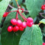
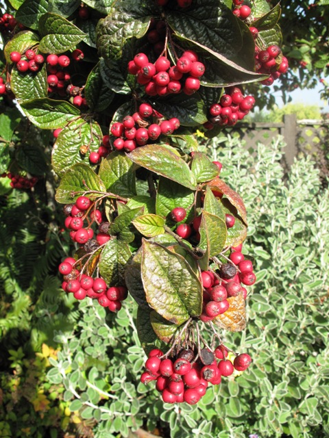
This cotoneaster will delight birds and humans alike.

back to the ritual and sustenance of gleaning fruit from the earth. Nuts, berries, pods, seeds, fruit – for eating or just eye-feasting – are essential elements of the autumn garden. Because I am a floral designer, I take particular interest in gathering rose hips, crabapple fruit, seed heads and even spent grapevines (with tendrils and curls) from the garden for use in my vases. 

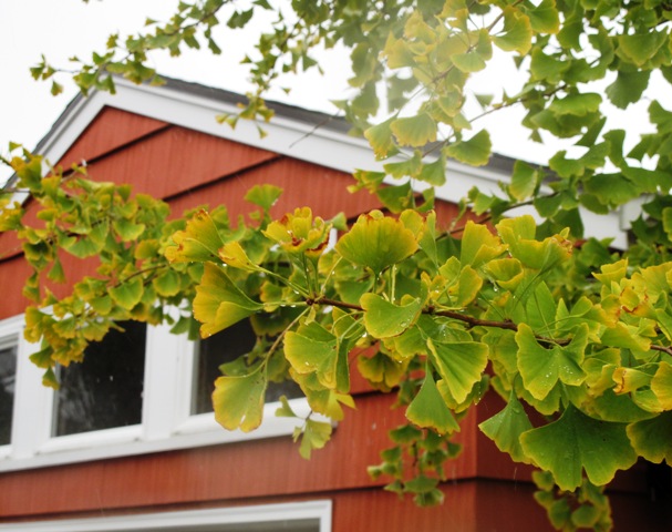
The yellowing gingko against a pumpkin-colored garage is a perfect fall scene.

Architecture: It goes without saying that structure is the backbone of 4th quarter gardens. Deciduous trees and shrubs, dormant perennials, disappearing annuals . . .they can do their thing and yet the arbors, gates, patios and pathways remain – thankfully. I take special note of the shadow-play created by light as it moves through a garden, catching shapes made by architectural elements and throwing those alluring patterns against walls and fences. 

Here are a few more seasonally-appropriate quotes to enjoy: 

” . . . asters: purple asterisks for autumn.” Conrad Aiken, Preludes for Memnon (1930) 

“Hurrah!  . . . it is a frost! — the dahlias are dead.” R.S. Surtees, Handley Cross (1843) 

A mosaic of autumn impressions: 

Autumn window boxes

Saturday, October 23rd, 2010

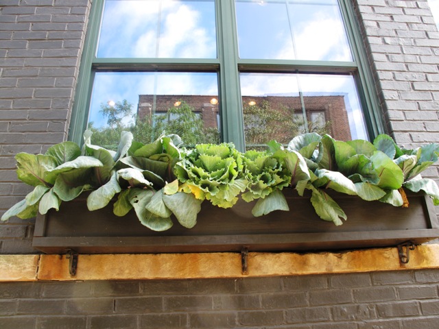
Ornamental cabbages and kales are all it takes to make some pretty cool fall window boxes.

Understanding “scale” is one of the most challenging of all design principles. So is finding just the right plant combo to fill a series of ginormous window boxes.

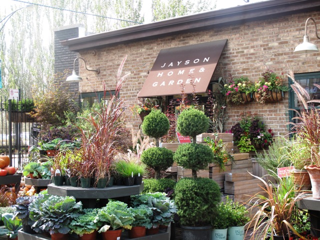
Jayson Home & Garden - a Chicago discovery for all the things I love

So imagine my delight at seeing a great example of both while visiting my college-freshman son in Chicago last month. While waiting for him to get out of class, I filled my free time touring the city’s uber-hip Lincoln Park neighborhood. That’s when I drove by Jayson Home & Garden.

A savvy retailer-friend in Seattle had told me about this must-visit shop that specializes in European-inspired home furnishings, antiques, accessories, tabletop and plants. . . so I slammed on the brakes of the rental car and took a tour – inside and out.

Jayson Home & Garden occupies a large, vintage warehouse on Clybourn Avenue. Since the building is located on a corner, there are many huge  windows that wrap both sides of it. Each window is about 4-feet wide and is adorned with an accompanying window box. You can see why any other autumn flowering favorite, such as a mum or pansy, could disappear in these deep, super-sized planter boxes.

I took this photo from across the street - see how dramatic the window boxes look with the large green-purple heads of cabbage and kale?

So here’s where the scale equation works brilliantly.

These boxes are planted with two forms of ornamental cabbage and kale. That’s it.

Packed tightly with alternating ruffled and rounded plant shapes, the design is simple and makes a big impact while filling no fewer than six of the massive boxes. I also love the way the designs anchor the tall windows and elevate something living halfway up the sides of the store’s exterior.

Check it out!

The next time you’re at the grocery store or garden center, pick up a few pots of these decorative plants.

You can experiment to see how well they add volume, scale and seasonal interest to window boxes, planters or containers.

Floral design – straight from the field

Saturday, October 2nd, 2010

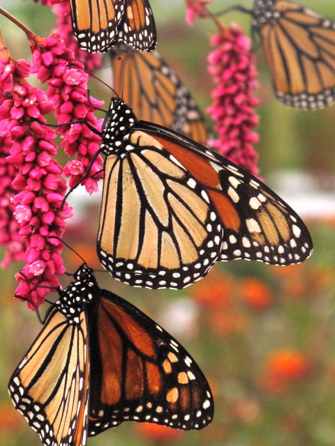
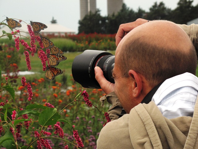
Even the Monarchs were willing to be photographed at the flower farm.

In a glorious Iowa field, I gathered flowers for my bouquets.

One knows she’s in relationship trouble when her own mother and dear friend Susan, who was her maid-of-honor in 1984, call to say, “I haven’t heard from you for a while, so I checked your blog to see what you have been up to.”

Umm. I’ve been on the road a lot lately. Way too much on the road for my liking. Being away from home and traveling for 15 of the 30 days in the month of September was ridiculous, but (I guess) necessary. Anyway, for the first time in three years, I went for a full month without posting an entry on this blog. Yikes!

There were many blog posts composed in my mind as an idea or notion would occur to me. “I should write that down,” I thought. But then, the droning lull of the airplane engine would convince me a quick “up in the air” nap was in order. Or I didn’t have access to the Internet. Or something like a deadline for a volunteer project or even – wow – a paying project . .  or someone else’s needs that were way more pressing came along.

So here we are in October – how apropos. The new leaf is turned. I don’t have to travel again until Oct. 12th and that is a single overnight jaunt for a photo shoot in Bellingham, 100 miles to the north.

Seriously, I should be able to squeeze in some news, insights, ideas, GARDENS, cool FLOWERS, and more between now and then.

The story I want to share here is from September 14-16. After six full and intense days for the annual Garden Writers Association Symposium in Dallas, I jumped on a tiny airplane and flew to Des Moines. I met up with the team I collaborate with at Better Homes & Gardens magazine. Eric Liskey (deputy garden editor), Jane McKeon (associate garden editor) and Scott Johnson (deputy art director) and I were up to our knees in flowers.

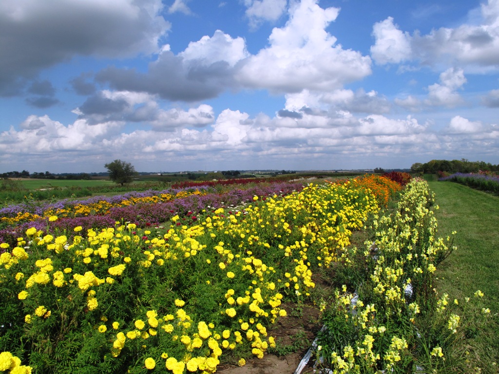
A view across the flower fields at Howell's Farm in Iowa. Isn't this just the most perfect cloud-filled sky you've ever seen?

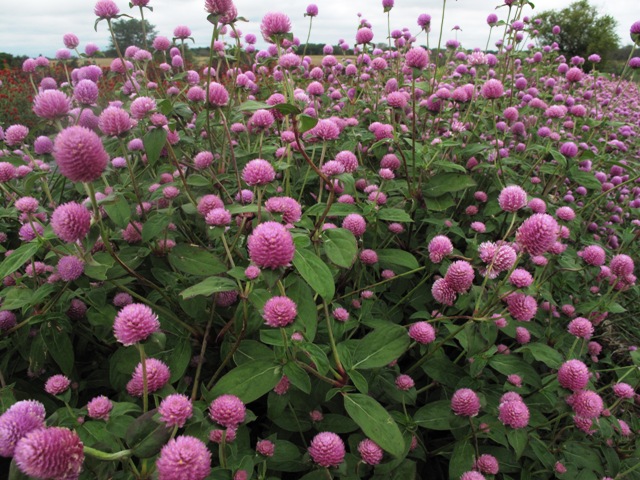
Globe amaranth (Gomphrena sp.)

The flowers – ingredients for a how-to story on creating bouquets from field-grown arrangements – were in all their glory at Howell’s Farm.

Based in Cumming, Iowa (in Madison County – yes, where the bridges are!), Howell’s is a sixth-generation family farm. After decades of raising corn and other agricultural crops, current owners Fred Howell and family began in 1985 to grow everlasting flowers.

Today, the farm is an 800-acre destination for people in search of the best varieties of decorative and seasonal crops. In the spring, summer and fall that means people come for the huge variety of annual and perennial flowers, herbs and grasses for cutting and drying. In the fall, they enjoy the amazing pumpkin patch and a cool corn maze. By the end of the year, in the winter, it’s the Christmas trees as main attraction.

After I landed in Des Moines, Eric and I drove out to Howell’s, about 25 miles outside of Des Moines, on a breezy, but gorgeous afternoon. Scott met us there and the three of us followed Erin Howell, Fred’s daughter, on a walk through the five-acre flower fields. As is my typical reaction whenever I visit a flower-growing operation, I was practically hyperventilating with excitement.

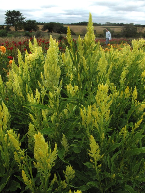
Celosia, plume type - what a great color!

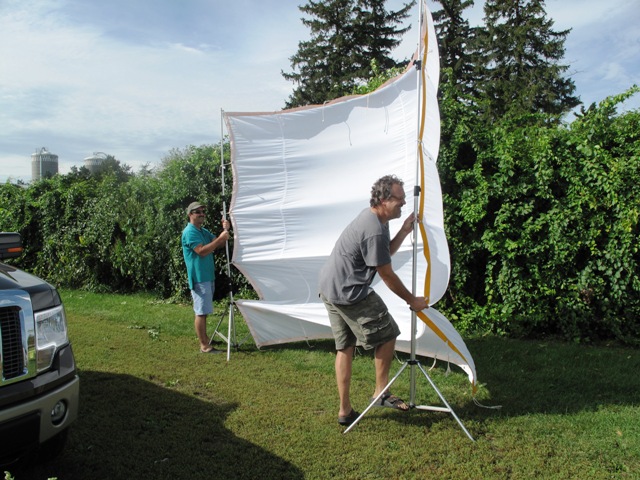
This shows how windy it was as Eric (left) and Scott (right) held the oversized "silk" to cast a shadow for one of the bouquet vignettes.

The variety of flower form, color and vigor in Howell’s crops was dazzling. The setting itself was breathtaking. We talked through our options of ingredients, including what “design lessons” we wanted to illustrate in the story, what sizes and shapes of vases we needed to use, and how to CHOOSE among all the great flowers that seemed to say “pick me, pick me!”

Back at the editorial offices, the three of us huddled with Jane to talk about the floral design projects we wanted to assemble and photograph the following day. This was no small task. Everything has to be mapped out so we could envision how things will look on the pages of Better Homes & Gardens.

The sheets on Scott’s clip-board featured his sketches of mini-magazine pages, complete with thumbnails of vases, blooms and notes to show how a four-page flower arranging story might look. We had to think about a color palette for the vases, taking into consideration the textures and hues of each flower lesson. Then Scott raced out to pick up props from all his secret sources (including tables, stands, vases, pitchers, etc.) and Eric and I took a drive over to his personal garden. We needed a few extra plant ingredients to enhance the designs we had in mind, so Eric obligingly let me cut some lambs’ ears and goldenrod from his borders. What else? Oh! a visit to the mall to pick up a denim shirt for me to wear in the photo shoot.

BH&G staff photographer Blaine Moats wanted the perfect Monarch shot. He actually got dozens of perfect shots because the butterflies were amazingly cooperative.

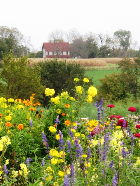
Yes, there it is: Francesca's House

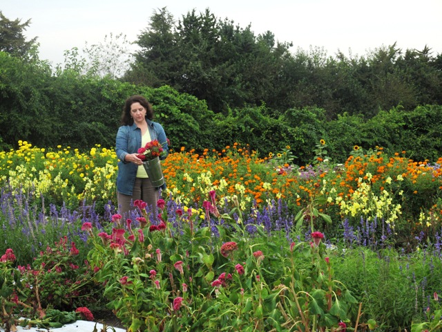
The next morning arrived bright and early and we met out at Howell’s around 7 a.m. Since Jane and I had designed the first two looks the afternoon before, we had a jump start for the photography. But then, the light seemed pretty good for a portrait, so Scott sent me out to cut flowers while our photographer Blaine Moats shot away.  As I walked between the rows of marigolds, zinnias, sunflowers and milkweed, filling my galvanized French flower buckets with stems, I thought: How lucky can a gal get? It was a joyous experience to just be there, to know that I was getting to create bouquets and arrangements that will be featured in the magazine sometime next summer, and to work with such talented, artistic colleagues.

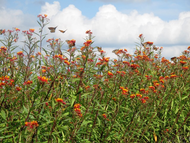
We were soon distracted by a sight so compelling and awe-inspiring that we simply had to stop working. Well, except for Blaine, who just turned his lens on the scene and began to document it. A harmonic convergence of Monarch butterflies was waking up as the day began to warm. They seemed to want to pose for photos, since even I was able to capture some really sweet butterfly portraits as the winged creatures breakfasted on the nectar of hot pink “Kiss-me-over-the-garden-gate” flowers (aka Polygonum orientale).

Milkweed with Monarchs (Asclepias sp.)

Me again - can't stay away from those blooms!

If that wasn’t thrilling enough, by the time Jane McKeon arrived in the afternoon, I had another amazing sight.

“Look over there,” Jane said, gesturing to a distant and lonely farmhouse. “Do you know that it’s Francesca’s house?” Yes, this was the actual Iowa farmhouse used by Meryl Streep’s character Francesca Johnson in the famous film “Bridges of Madison County.”

Another reason to visit Howell’s Farm is to gaze across rows of flowers and see that setting. I may have to rent the film just to see that house on the screen, and to appreciate Meryl’s Oscar-nominated performance from 1995.

There’s lots more to share but my bouquet designs are embargoed until they show up in the magazine. I can’t wait to show them off to you.

Inspiring garden centers and outdoor living retailers

Wednesday, August 25th, 2010

This was my first visit to the IGC Show in Chicago - the 4th Annual Show was impressive

I had a great gathering of "indie" retailers for this presentation.

After presenting to a welcoming audience at last week’s Independent Garden Center Show in Chicago, I’m more convinced than ever that there is a huge passion and vitality among the “indies” of horticulture. 

These are the women and men who adore plants, love to share their knowledge about growing things, don’t mind getting dirt under their nails, and who understand that connecting with other gardeners is what it’s all about. 

If you can run a business like that, well, then you are blessed. I’m not saying it’s easy. These are hard-working plantswomen and men; some of them are from longtime nursery families who grew up growing and selling plants. Others come to garden center life through different paths. But people find their way. And in the face of competition from big box retailers, the “indies” are almost as threatened as small-town booksellers (Although I just read an article in New York magazine about the return of independent book stores.) From what I saw last week, with the aisles of Chicago’s Navy Pier teeming with thousands of trade showgoers, I’m convinced the “indie” garden center and outdoor living retailer is a force to be reckoned with. 

My talk highlighted some of the successful participants in this movement. I promised to post an excerpt of this talk and some highlights here for my audience members to read. I”m also interested in comments and suggestions for other “indies” who are doing things right in their own community. Please let me know where you gain inspiration and make a “connection” with the local garden center in your community. I really do want to know! 

INSPIRING GARDEN CENTERS AND OUTDOOR LIVING RETAILERS are . . . 

READ MORE…

A meadow in a vase

Saturday, August 21st, 2010

The September issue of Better Homes & Gardens features my “Debra’s Garden” column encouraging readers to add ornamental grasses to their seasonal flower arrangements.  

"Meadow in a vase" is the theme of my September column for BH&G

The photo that accompanies the piece depicts a gorgeous autumn bouquet bursting with asters, fall foliage and miscanthus blades.  

Its sultry palette includes dark purple, russet-red, gold and green elements in a clear, glass vase. As a footnote, I promised to show off my favorite grasses for cutting and flower arranging here on this blog.  

As it turns out, I’ve been seeing a lot of wonderful ornamental grasses and grass-like design ingredients lately. These days, I have dreamy plumes of fountain, feather, and silver grasses on my mind.  

There’s something both completely romantic and purely modern about grasses in floral arrangements (or in the landscape, for that matter). Here’s a peek at what’s caught my eye this year, including my favorite grasses for cutting:  

FROM THE FLOWER FARM  

Owned by Diane Szukovathy and Dennis Westphall, Jello Mold Farm is one of my favorite local flower sources here in the Pacific Northwest. Diane and Dennis use sustainable practices and recently they’ve delighted floral design customers with gorgeous late-summer grasses. You can find Jello Mold Farm at the Queen Anne Farmers’ Market every Thursday – be sure to check out the incredible selection of downy and fluid grasses.  

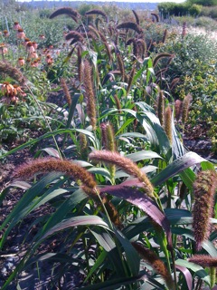
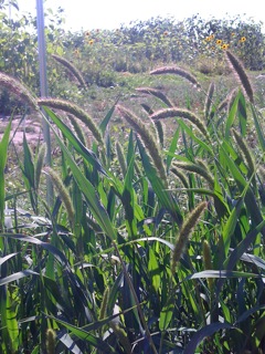
Here are a few show-stoppers included on Diane’s “fresh list” that she emails to customers every Monday. The four images you see here were taken by Diane: 

Jello Mold's RED JEWEL MILLET, with large, elegant, arching, red-toned seed-heads approximately 5 inches long

Jello Mold's GREEN MILLET, with 3-inch-long, fuzzy green seedheads and a wonderful texture

These awesome examples are ornamental millets, not edible ones. 

While actually cultivars of Pennisetum glaucum, you can almost convince yourself that they are relatives of the corn family if you squint. 

When cut for bouquets, the plants yield both the sweet, furry seed-heads, as well as the strapping, wide leaf blades. Both plant elements are useful in an arrangement as beautiful counterpoints to blooms. 

Like many good things, “more is better.” For example,  I like to gather several seed-heads together in a clump and inset them into the arrangement. 

It’s a pretty picture to have three to five seed-heads cascading out of a bountiful grouping of seasonal flowers and foliage. 

READ MORE…

A true blue garden with a heart of gold

Sunday, August 8th, 2010

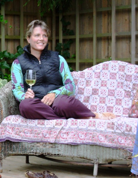
Tina sure knows how to enjoy herself in the garden! Here she is, resting on my vintage wicker in my former Seattle garden, 2006.

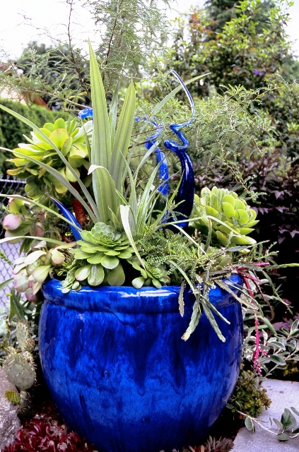
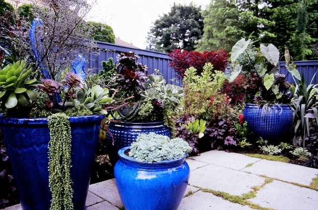
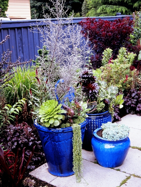
Great container design paired with whimsical glass art makes this pot a stunning focal point in Tina and Paul's garden.

I first met Tina Dixon in the early 2000’s when I was asked to join her as a judge for the Washington State Nursery & Landscape Association design awards.

Her bubbly personality and welcoming nature included me in the circle of other judges, most of whom had previously served together. Our judging session took place at her home in Bothell, just north of Seattle, allowing me to gain a better sense of just who Tina is. In short, Tina is a connector. She connects colleagues, clients and friends, helping everyone feel part of the Seattle horticultural community. You can’t help but have fun when she’s in the room (or on the tour bus or in the garden).

Through Plants a la Cart, her container design business, Tina creates breathtakingly gorgeous planted pots for some of the Seattle area’s poshest addresses.

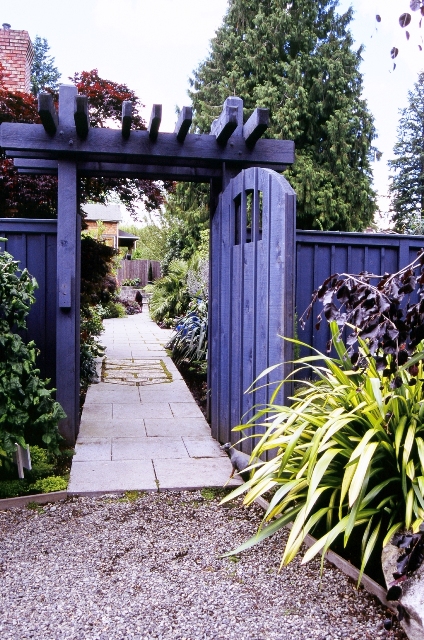
Several years ago, she turned her attention to the property she owns with her husband Paul Stredwick. Their hand-crafted garden is a vibrant, color-infused, texture-layered, art-filled spot on the map. And garden tour-goers, if they are lucky, can occasionally get beyond the denim blue-stained gate to see the surprising horticultural world inside.

The photographs shared here are ones I took in 2006 when Tina and Paul opened their Golden Trowel Award-winning garden to the Hardy Plant Study Weekend participants. I served on the event’s planning committee that year, so I knew what a treat was in store for the several hundred participants who flocked there during the Open Garden schedule.

In 2007, Garden Design magazine awarded Tina and landscape designer Mike Jeppesen the Golden Trowel Award for this gorgeous Blue-Themed landscape

Since then, I know that Tina and Paul have received numerous requests to add their garden to area tours. They recently decided to open the property to benefit a cause that they personally support, Hopelink. Hopelink is an United Way agency that offers an array of programs that enable families in crisis to make progress toward and achieve self-sufficiency.

You can see the garden next Sunday, August 15th, at two different events. An evening Garden Party (6-8 p.m.) includes wine, hors d’oeuvres and music by The Chromatics. Knowledgeable docents will be on hand to answer questions during the festivities. Tickets to the private garden gala are $150 with a portion tax-deductible. Register online or call 425-897-3703.

The Dixon-Stredwick garden is also open earlier in the day, Noon-5 p.m. for a $50 donation to Hopelink. You can pre-order tickets for the tour here. Or call the number above.

For some background on this garden, here is the story I wrote in April 2007, which appeared in Seattle Homes & Lifestyles magazine. Subsequently, their garden has been featured by other publications, so I feel pleased that Tina said “yes” to me first!

True Blue: Designed with a harmonious blue-hued palette, a Bothell garden shows off art, architecture and plants

Written by Debra Prinzing

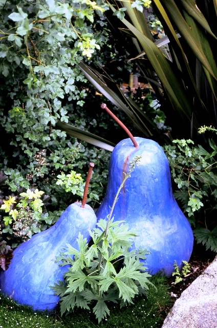
Painted periwinkle, two concrete pears by Woodinville artist Judy Thomas continue the color story.

If, as color theorists say, blue has therapeutic qualities, then Tina Dixon is a very healthy woman. Whether it’s a bright or subdued blue, Tina thrives on the hue.

Owner of Plants a la Cart, a successful container-garden design service, Tina considers the serene hue her signature color. Although she doesn’t limit clients to her preferred palette, Tina is well known for filling azure- and cobalt-glazed urns with dazzling combinations of leaf shapes, textures and colors.

Her penchant for blue infuses her own landscape, giving it a cohesive theme. “Blue is my favorite color,” she proclaims.  

When they bought a one-third-acre Bothell pasture in 1983 (previously inhabited by a lone calf), Tina and her husband, Paul Stredwick, were in their late 20s and intent on building their first home, a gray, barn-shaped Dutch colonial, trimmed in blue. Landscaping was not on their minds or in their budget.

By 1987, Tina abandoned an office job for a horticultural career. She studied landscape design at Lake Washington Technical College and launched Plants a la Cart. The pasture was by then home to two rambunctious golden retrievers.

Occasionally, Tina and Paul had time to tackle their own backyard. They renovated a deck and planted an 80-foot-long mixed perennial border against the south fence. “Paul and I were trying to pick away at the landscape,” she recalls. “Wherever we stopped one year, we started there the next. It wasn’t quite flowing.”

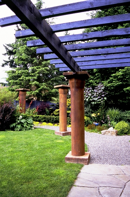
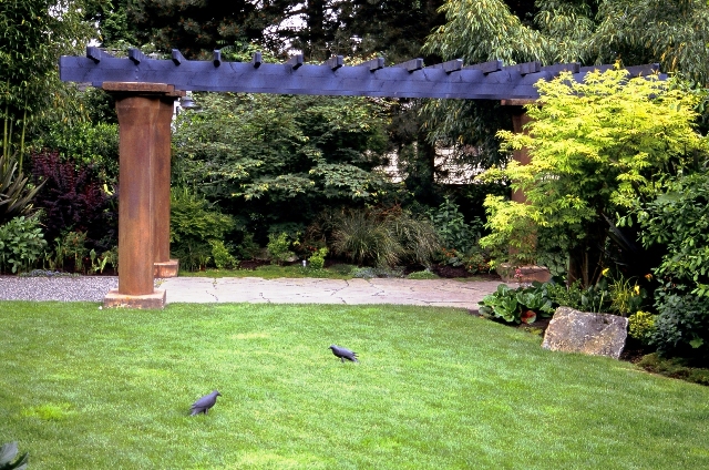
The blue-stained arbor is supported by DIY columns.

In 2002, knowing they wanted lighting, irrigation and hardscaping in the garden, Tina and Paul agreed to ask a landscape designer for an overall plan.

It was almost inevitable that Mike Jeppesen of Sammamish Landscape would help the couple create their blue-themed dream garden, since he and Tina had collaborated earlier that year on a gold-medal “Blue Garden” for the Northwest Flower & Garden Show. With a blue-stained gate and arbor, Pennsylvania bluestone pavers, blue Asian pots and collections of blue-tinged conifers, the designers made a rare statement with this cool palette. The design also earned them the Pacific Horticulture Award.

“Like Tina, I prefer to deal with foliage—this garden is virtually a tapestry of texture and leaf color,” Jeppesen says. “I also knew that even though Tina and Paul and the dogs needed to enjoy the garden, it also had to be a space for her to show off what she does best—it’s a garden that people will visit.”   

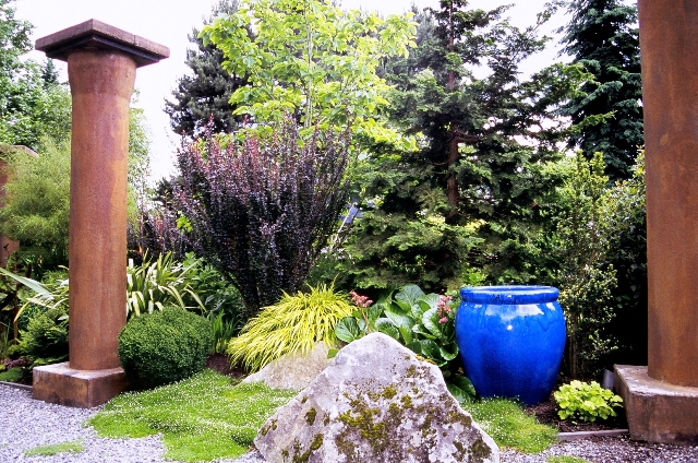
Tina and Paul’s garden invites visitors to enter along a charming walkway, pass through an oversize blue gate and pause at a dramatic “foyer” where one of eight ochre-stained concrete columns appears as a focal point.

From here, a 4-foot-wide strolling path meanders clockwise around the garden’s perimeter. An irregular section of lawn is reserved at the center for playing ball with the dogs. More free-standing columns punctuate the heavily planted borders, drawing the eye through the landscape to a four-column pergola in the distance.

A grouping of blue Asian pots presents Tina’s favorite container designs, incorporating bear’s breech (Acanthus mollis), golden smoke bush (Cotinus coggygria ‘Golden Spirit’) and Canna ‘Tropicanna’.

“Columns were on my wish list but were killing the budget,” Tina admits. Jeppesen suggested using concrete waste-water pipes, set on end, to serve as columns. At $80 each, the 8-foot-long pipes were a perfect solution. Tina asked artist Johnny Ward to transform the ordinary concrete with a rich gold-brown patina. Blue-stained lattice boards and rafters form the pergola, complementing a Pennsylvania bluestone terrace beneath.

To give the landscape the feeling of maturity, Jeppesen and his crew placed boulders, large rocks and stone steps throughout the landscape. He also encouraged Tina and Paul to incorporate large trees and shrubs into the design. “Even though Tina deals more with perennial-style plants, I wanted her to use trees and shrubs to provide interest when there are no flowers in bloom,” he says. “They give substance to this landscape.”

Tina and Paul agreed and headed to Oregon, where they used Tina’s wholesale connections with a tree farm. They selected trees to complement the scale of their house, including several hinoki false cypress (Chamaecyparis obtusa>‘Gracilis’), plume cryptomeria (Cryptomeria japonica ‘Elegans’), weeping copper European beech (Fagus sylvatica ‘Purpurea Pendula’) and a flowering dogwood (Cornus x rutgersensis ‘Constellation’).

Wine, burgundy and maroon foliage are great complements to blue tones.

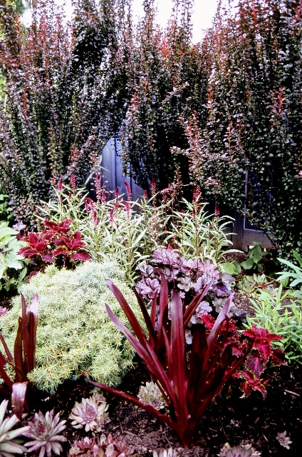
One-color gardens are appealing because of their simplicity, allowing plants and constructed elements to speak a common design language. Tina recognized that gold, lime, wine and silver foliage plants gain a visual boost when placed near blue pots and architecture.

She adapted container design techniques when planting the landscape. “Because I work on such a small scale, it was an overwhelming thought at first,” she says, “but you just have to take the principles of putting the right leaf shapes and textures together and use them in the larger context.”

Blue-glazed Vietnamese pots hold everything from gold-leafed ornamental trees and striped tropical plants to exuberant vines and silvery succulents. Tina’s adventurous designs rely on attention-grabbing plants that look even better when paired with blue. “I’ve been really tempted to use other container colors,” she says. “But that would feel like a mixed jar of jelly beans. Instead, I decided to be bold and consistent. The blue pots make sense and tell a story.”

Landscape designer-contractor: Mike Jeppesen, Sammamish Landscape, (360) 435-3769 or amjeppesen@earthlink.net

Container designer: Tina Dixon, Plants a la Cart, (425) 481-2194 or stredson@aol.com

Carpenter (pergola, entry arbor and fence): Cliff Chatel, Woodmark Construction, (425) 827-5242

More photos to delight – and tempt you to attend next Sunday’s tour and garden party:

There is a small patch of dog-friendly lawn in this garden, yet Tina can't resist placing sculptural black crows on its surface.

Another detail shot revealing Tina's incredible container design talent and her color sensibility.

A brilliant, blue-glazed urn is a delightful counterpoint to trees, shrubs and rock.

Playful “hopscotch” pavers guide visitors to the blue-stained entry gate (a hand-painted sign nearby reads “All who enter must hop” and another, inside the garden, asks “Did you hop?”).

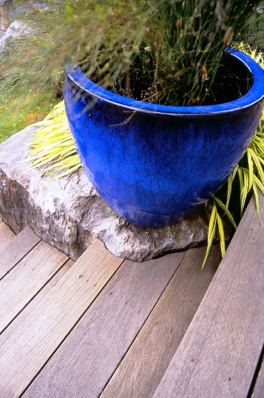
Here's a cool detail showing how Tina and her landscape cohort Mike Jeppesen carved the decking around a piece of basalt - just like a puzzle piece.

Not much to say but: "Feast your eyes on this tapestry of texture and color"