Debra Prinzing

Get the Email Newsletter!

Archive for the ‘Plants’ Category

Got twigs? Branch out and decorate your garden

Monday, April 25th, 2011

As you’re tidying up the spring garden with pruning, trimming and other projects, inevitably you will end up with a pile of twigs. Yes, they can go into the chipper or the compost bin, but these pliable, young branches can also be pressed into service in the garden.

I wrote about “saving twigs” for my Debra’s Garden column in the upcoming May issue of Better Homes & Gardens (you can already find it on newsstands). All you need is a clean, sharp pair of secateurs (pruners) or loppers and a pair of gloves to protect your hands while working.

Spring pruning projects usually produce armloads of branches and twigs. Give those cuttings a new purpose and build simple, natural-looking plant supports. Use twigs to stake young seedlings — just poke sticks into the soil a few inches to anchor them. Lash three or more branches together at the top to form a tee-pee trellis for sweet peas or edible peas. I also curve thin branches into a half-circle shape — stick both ends into the soil and overlap several of them to create scalloped edging for veggie and herb beds.

Here are some photos to inspire your next pruning project:

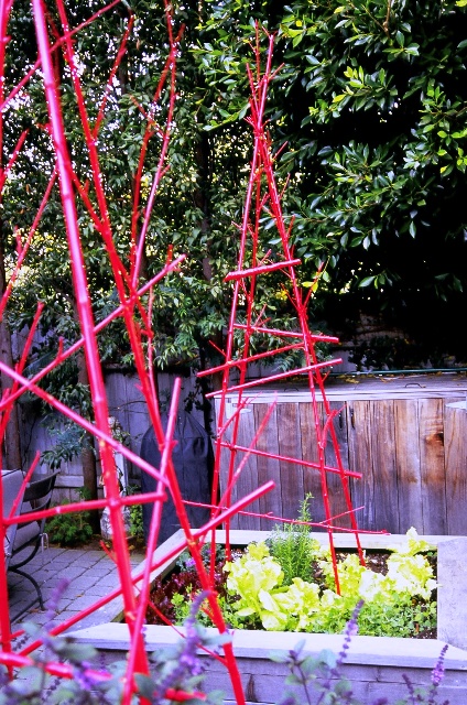
Designed by landscape architect Joseph Marek, these zesty veggie garden teepees are made by painting twigs Chinese red and lashing them together.

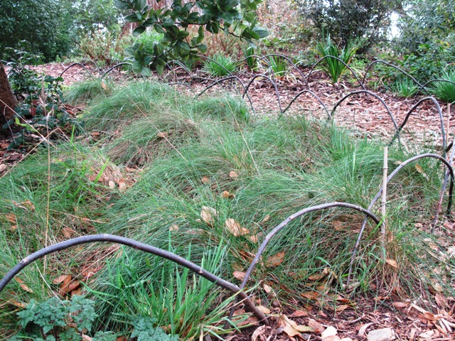
Twigs are bent into a half-circle, with each tip inserted into the ground; when these "scallops" overlap each other, they create a tidy edging along a path or planting bed.

P.S., someone asked about my reference to “lashing together” on my Facebook page. I do not know exactly how the teepee was lashed together, but having made similar structures in the past, I can say that I’ve used anything handy – twine, garden twistie ties, wire and even rubber bands. Use your ingenuity!

All about designing with gravel

Sunday, April 3rd, 2011

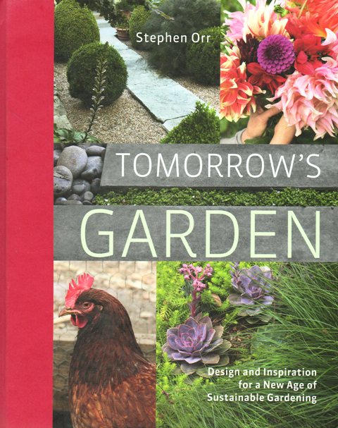
A few weeks ago I had a phone date with Stephen Orr, the guy who has held all the jobs I’d love to have: Garden Editor for House & Garden magazine; Garden Editor for Domino magazine . . . and now, garden editorial director for Martha Stewart Living magazine.

He is one of the friendliest and most genuine individuals I’ve ever had the pleasure to meet in the magazine world. It was a treat for me to interview Stephen about the publication of Tomorrow’s Garden, his first book. I’ve met Stephen in person a few times, both in Los Angeles at a Garden Conservancy symposium, and in San Francisco when I spoke at Flora Grubb Nursery after Stylish Sheds and Elegant Hideaways, my own book, was published. We garden writers really do live in a small world!

Thanks to Craig Nakano, my editor at the Los Angeles Times HOME section, for agreeing to feature my Q&A with Stephen.

You can click here for the full story. And click here for a web gallery of Stephen’s photography that accompanies his book. Here is an excerpt of my interview with Stephen:

“People don’t think much about where gravel comes from as a resource,” Orr said, yet gravel gardens are becoming increasingly popular. His book features gravel landscapes from Venice and Ojai to Austin, Texas, to Nantucket, Mass. We asked him to discuss gravel as a sustainable design material:

What appeals to you about the use of gravel?

It is such a great base for many styles, from traditional to modern. There are plenty of people in Los Angeles and San Francisco who have jumped on the bandwagon wanting to make low-water gardens, but I’m happy to see it catching on in other parts of the country. The California lifestyle is so amazing, with outdoor rooms, and they can be “floored” differently. One room could be floored with grass, another with stone pavers or gravel.

Designers praise gravel gardens as permeable and an alternative to lawns. How has your view of the material changed?

I was visiting nursery owner Flora Grubb in San Francisco, and she told me she often recommends gravel to customers. And then the question “Where does it come from?” came up. Our conversation opened my eyes to begin viewing gravel as a finite resource.

Where does it come from?

As with so many environmental choices, the decisions we make trying to do the right thing are complex and often somewhat overwhelming. In many cases, gravel does indeed come from local quarries. The Austin gardens in my book used local gravel. Those gardeners like how it matches the colors of the natural geology around them. But in other areas, its origin is a big question mark. Even after a lot of research, I found I still have a lot of questions about how responsibly gravel is mined. The EPA monitors gravel production, which is a huge industry mainly for construction and highway building. In comparison, gravel for gardening use is minor, but it’s still something to be conscious of.

What questions should homeowners be asking about the gravel they buy?

I suggest you approach it like having a local consciousness of food. Don’t buy bags of gravel if you don’t know where it comes from. It may be shipped longer distances than is environmentally responsible. Try instead to source the material close to home.

What type of gravel do you recommend?

There is a difference between “crushed stone,” which has sharper edges, and “pea gravel,” which is rounded. Some people prefer walking on the rounded pea gravel, but consider the environmental impact it takes to extract it from ancient stream-beds formed by alluvial processes over millennia. Pea gravel isn’t a manufactured product. It’s not even a renewable resource. Many forward-thinking designers are switching to more jagged, crushed limestone or granite instead.

Any tips on how gravel should be installed?

One major thing I learned is that the depth of gravel is important. If it’s laid too deep, it’s like trudging through deep snow. Most of the designers I interviewed recommend you first put down a layer of “road base,” bigger pieces of crushed stone — an inch or two in length. Lay it very flat with a compactor and then place just a few inches of crushed gravel or pea gravel on top. This approach makes a very stable surface.

What are some of the interesting ways people use gravel?

I love the modern look of some of the gardens in my book. But I also really love gravel gardens with a more traditional influence where plants are encouraged to self-sow. I’m a plant nut. I come at gardening because I love plants. So to me, the space that contains the plant — the garden — is a frame to show them off. I love seeing volunteers like verbena or a spire of silver verbascum in the gravel. Or, I like to see gravel as the flooring for a spare space containing just a water feature.

Do you see gravel as the anti-lawn?

I like to see gravel and lawn used in combination. Just as a lot of us live without wall-to-wall carpet and instead have rugs with wood floors, I encourage people to think of their lawn as an area rug. Think about using it with an element of crushed rock, such as a flat area under a tree or where you need better drainage.

Inspiration comes in many forms

Wednesday, March 30th, 2011

A spring bouquet in a Mason Jar inspires . . .

The other day, while talking with my friend Lorene (one of the most creative people I have known since we were college classmates together), I described some of the cool design ideas I’ve spotted in the past few weeks. My own enthusiasm for all this visual stimulation made me realize my “list” could be a blog post here.

After seeing these ideas in Seattle, Los Angeles and New York, my own idea-bank has been rekindled. Witnessing the talent of others doesn’t ever make me envious. No, it makes me want to up my own game and push myself further to do something wonderfully better as a writer, a gardener, a designer.

The type of inspiration I’ve seen lately has been truly exquisite. Great design is great design, whether in the garden, the home, or the restaurant. When you see it, you know it!

There may be no other response than to gaze in awe and say – WOW. But if your muse can be stirred or awakened by these ideas, by all means, use them as a starting point for your own artistic expression. I hope you enjoy where all this beauty takes you!

A TEENAGER WINS

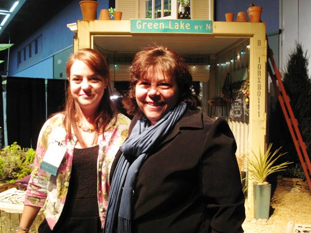
17-year-old garden designer Courtney Goetz won a Gold Medal at the Northwest Flower & Garden Show. Her mom, designer and writer Sue Goetz, is one of her influences.

At last month’s Northwest Flower & Garden Show, one of my most favorite annual events, I was invited by Julie Chai of Sunset Magazine to help “judge” the Sunset Outdoor Living Award.

We were smitten by a small but extremely innovative garden called “Paradise (to be) Regained . . . borrowing Thoreau,” which we honored with the Sunset award.

The critera recognizes a garden that exemplifies “fresh, useful and achievable ideas.” In this instance, the designer was 17-year-old Courtney Goetz.

Courtney, the daughter of garden designer and writer Sue Goetz, grew up in the garden-making business. In 2005, when she was 11, Courtney helped mom Sue design a display garden named “A Child of the Garden Grows .  .  .  .” for this same show. Now, she has made a garden herself – and guess what? In addition to the Sunset Award, the show judges honored Courtney with a Gold Medal.

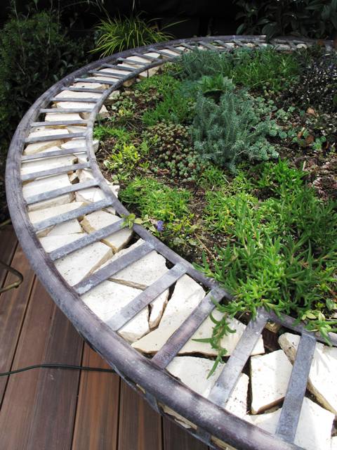
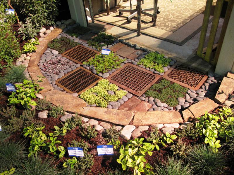
This half-circle garden floor treatment by Courtney Goetz shows how to pair salvaged metal grates with colorful groundcovers to create a "welcome mat" at the entry to a garden shelter.

As her Senior Thesis Project for Gig Harbor High School, Courtney wanted her design to be all about “recycling, re-purposing, and ‘re-characterizing’ used materials for use in the garden,” she says. “My goal and intent for this garden is to have green ideas for everyone to instill in their lives. I want the message to get out that not everyone can buy solar panels or hybrid cars, but anyone can and will make a difference by using a little bit less and utilizing what we already have.”

One of the many wonderful – and really clever — details of Courtney’s display garden was the checkerboard “floor” treatment, combining recycled metal grates with ground covers and rocks.

We loved this idea as a modern twist on a “welcome mat.” Courtney selected varieties of sedum and sempervivums in gold and dark green, as well as smooth rocks and the metal grates. It all adds up to a really gorgeous detail in the garden.

Look for exciting things to come from this young talent. We can’t wait to see more!

ROUGH AND SMOOTH TEXTURES

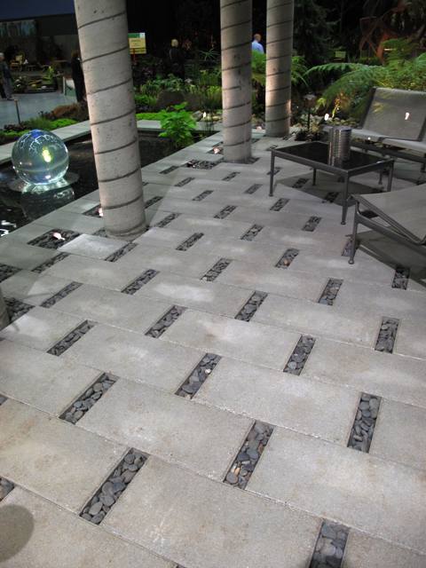
Openings between each paver makes room for a permeable detail of smoth stones.

Design detail

Another wonderful “floor” treatment appeared in a garden called “Wrinkle in Time,” designed by Karen Stefonick of Karen Stefonick Design. Her garden won the Best in Show Award, also called the “Founder’s Cup.”

Since I was able to tour it up close during the judging, I realized how truly creative Karen is when it comes to working with landscaping materials. She devised a patio using two simple ingredients: Concrete Pavers and Tumbled Stone.

Look closely at this pattern created by the slightly offset 1-by-2 foot concrete pavers. By staggering their placement and filling a 2-inch gap at either end of each paver with small rocks, Karen has accomplished two things.

First, she uses the texture of stone to contrast with the smooth concrete, which results in an attractive pattern. Second, this treatment turns a patio into a permeable surface for collecting rainwater into the ground rather than allowing it to stream down to the curb and disappear. Very cool!

BIRTHDAY BOUQUET

What a gorgeous grouping of flowers and vases!

During all the Flower Show activity, including giving three talks in two days, I almost forgot to celebrate my birthday. But thankfully, my friends and family didn’t forget.

Flower detail

One of the best surprises was the delivery of flowers from a local West Seattle shop called Fleurt Studio.

The gift-giver was my sister-in-law Sandra B. Henriquez. Her touching gesture of sending flowers was made more amazing because instead of resorting to the generic, 1-800 route, Sandi did her homework to find a local flower shop that offers unique, one-of-a-kind gift bouquets. She called (long-distance from Washington, DC) and spoke with Samantha, the owner, and discussed exactly what would be included in the delivery.

And here’s what arrived: A “floralscape,” an eclectic grouping of five differently-sized vases holding mostly purple and plum ingredients. I loved the whimsical inclusion of two canning jars, a bud vase, a vintage bottle and a miniature glass cup. Together, they created a floral display that no single bunch could equal. Magical, huh?

LOS ANGELES VIBE

Stunning!

After February’s Flower Show madness, March welcomed a trip to Los Angeles, my former home town. Living there for the past four years was an amazing adventure, especially when it comes to learning about design with new eyes. The city, and in fact all of Southern California, was for me a big design graduate school – with lessons in architecture, industrial design, sculpture and history.

While living in LA, I spent a lot of time scouting homes and gardens for the Los Angeles Times HOME section, as well as visiting retail sources for plants, furniture, gardening accents and more.

Rolling Greens Nursery in Hollywood is one of my favorite haunts. It was the site of our Garden Design magazine Hollywood Issue party last April – one of those exciting moments when I said to myself: I can’t believe I’m living here and doing this type of work I love!

Teabags, thousands of them!

When I returned to LA last week to work on a photo shoot for Better Homes & Gardens, I took our art director Scott Johnson to visit Rolling Greens. I wanted him to see several of the area’s cool nurseries. We stocked up on some plants for the next day’s shoot, and poked around buying ourselves tiny agaves to bring home to our colder climes (Seattle for me; Des Moines, Iowa, for Scott – yes, I know. It’s really futile, but we try).

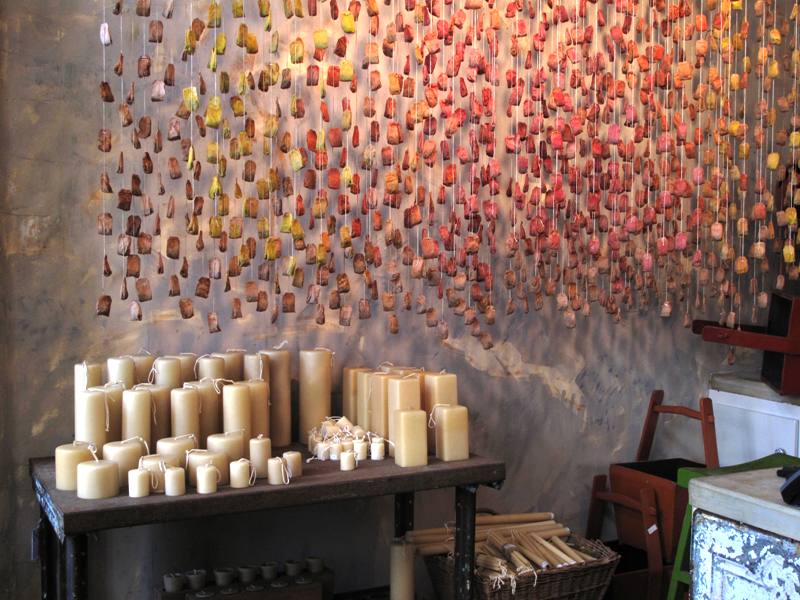
But the wow-factor occurred when I walked into the large space where cookbooks and culinary/gourmet products are typically sold. There along the far wall hung a new installation that I can only describe as a Tea Bag Curtain. One of the staffers told me that the artful treatment had just been hung by Rolling Greens creative director Angela Hicks and her crew.

Hundreds (maybe thousands!) of hand-dyed tea bags, attached to long strings create a beautiful semitransparent cascade, suspended from rods attached at the ceiling. I can only imagine how much time and care was taken to create this rosy-melon masterpiece.

Organic and delicate, this “curtain” is so charming. I am eager to figure out how to replicate it somehow. Simple ingredients paired with masterful execution . . . it adds up to something truly remarkable. This Tea Bag Curtain isn’t “selling product,” but who cares? It goes miles at saying to Rolling Greens customers: we care about design and we’re a place where you can be inspired.

ON TO NEW YORK CITY

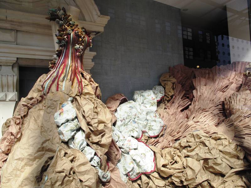
Anthropologie's lavish zipper gown - look close and see how it was made with straight pins!

Here's how the crushed paper skirt emerges from the tight, pastel-colored bodice....

Only days after spending 48 hours in Los Angeles, I flew to New York City. I’ve previously written about visiting the awesome High Line Park, but here’s another visual treat, shown purely for its beauty and innovation.

I turned the corner on my way to the Chelsea Market, a huge warehouse-turned-hipster food mall, and there on the corner was a gorgeous Anthropologie window display.

Some super-creative designer turned a dressmaker’s form, yards of zippers, straight pins and crushed butcher paper into a fanciful ball gown. The way the separated zippers form the bodice so the gold and silver metallic zipper teeth sparkle in the light . . . dazzling. But at the top of each zipper, the “end” has been spiraled into a little rosette.

Just take a look and feast your eyes on the charming way a few simple ingredients become Cinderella’s new gown!

Now, go out and do something uninhibited and artistic today. I dare you! I’m going to try it myself.

Field trip: New York’s High Line Park

Thursday, March 24th, 2011

The High Line is NYC's newest public space.

I spent about 48 hours in New York City last week, staying at my favorite bed and breakfast at West 81st Street and Columbus Avenue on the Upper West side.

I mistakenly scheduled the visit to coincide with St. Patrick’s Day, one of the many days when people in Manhattan go crazy, whether they are Irish or not.

Yet, the weather was “pure spring” – certainly milder than we have had in Seattle lately – and my spirits were lifted just getting off the subway from JFK to the city.

My objective for stopping through NYC on my way to speak in Toronto was to meet some editors face-to-face and to spend time with some very dear friends. I had a half-day “free” and unscheduled, so last Thursday morning I hopped the downtown C Train across the street from Central Park and rode it to West 23rd Street. My destination: the nearly two-year-old public park called The High Line.

You’ve probably read about this amazing public-private endeavor – an elevated park that runs along 10 to 12 blocks on a former 1930s freight track high above Tenth Avenue between Chelsea and the Meat Packing District. I’ve read lots about it, too. But for a landscape design and horticulture observer like me, nothing compares to the first-person tour.

A true sign of spring: Viburnum x bodnantense 'Pink Dawn'

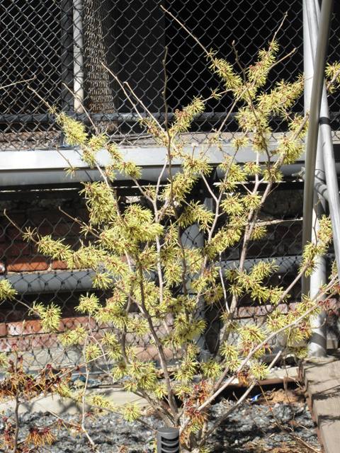
Wonderful witch hazel in bloom.

When I had dinner the night before with my talented NYC go-to-gals, Ellen Spector-Platt and Ellen Zachos, co-creators of the popular NYC gardening blog Gardenbytes, they gave me some tips on where to disembark from the subway (23rd Street Stop) and warned me that not much would be in bloom.

Blooms were not essential, yet I did enjoy spotting crocuses, witch hazel and a couple beautiful flowering ‘Pink Dawn’ viburnum shrubs showing off in the warm, spring sun.

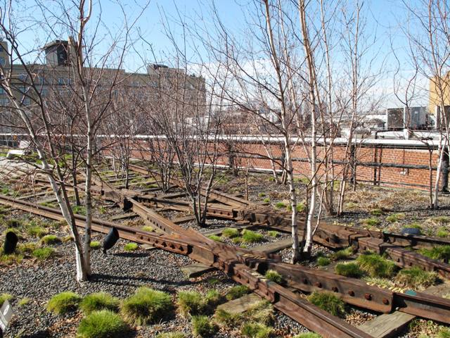
The edgy, industrial setting was just as delightful to my eyes. The rails of this RR-in-the-sky last carried a train of frozen turkeys in 1980.

Over the ensuing decades nature has had her way with the long-abandoned site. According to the High Line web site, its designers selected plants to “echo the wild, self-seeded landscape that grew up on the structure after the trains stopped running.” The landscape was designed by James Corner Field Operations in partnership with Diller Scofidio + Renfro.

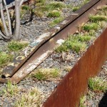
A beautiful grove of trees, planted between the rails.

The origins of this reimagined public space can be traced to 1999, when community residents founded Friends of the High Line, the nonprofit public conservancy that today operates under a license agreement with the NYC Department of Parks and Recreation.

The forward-thinking citizen group fought for preservation and transformation at a time when the historic structure was under threat of demolition. Friends of the High Line now provides approximately 70 percent of its annual operating budget and is responsible for both stewardship of the park and its public programs.

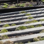
Beginning my tour at the northernmost entrance on West 20th Street, I climbed the steps and arrived to see a new view of the Hudson River and surrounding buildings. Light and airy, the park’s design has retained original crisscrossing steel tracks where groves of trees, shrubs and grasses are planted. The main walkway, which is wheelchair and stroller-friendly, appears to be formed by staggered bands of granite that emulate railroad tracks and also accommodate soft vegetation.

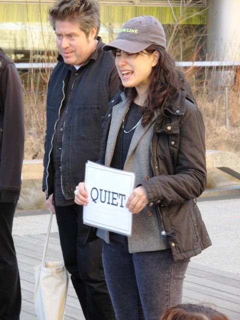
Even parks in major metropolises can be "QUIET"

Look up: it's a park!

Plenty of seating encourages people to rest, admire the scenery or eat a sandwich.

I happened upon a group of schoolchildren on a class tour near the bleacher-style amphitheatre where public performances often take place. A docent held a sign that read QUIET, and I smiled as I overheard her telling the children that the designers wanted to create a place where the noise of the city streets wasn’t so powerful. You know, quiet is one of the strongest sensations I experienced on my visit.

The juxtaposition of a park-in-the-sky with a city’s hustle-and-bustle down below seemed to amplify the silence. And I envy those folks in Manhattan who can visit The High Line whenever they want.

Makeover ideas for your concrete garden ornaments

Saturday, December 4th, 2010

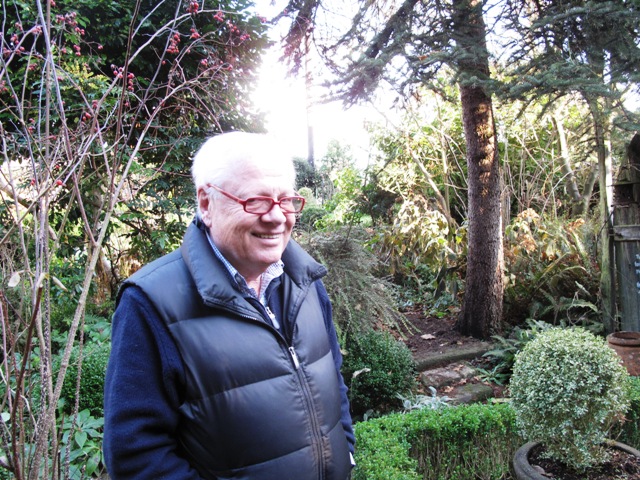
Meet Mark (aka "Marco") Henry ~ in his garden

On Friday, I enjoyed a rare luxury – a return to a favorite garden I’ve written about twice in the past decade: 

I hopped in the car and drove to Snohomish, Wash., where I lunched with two long-time friends from my days working for The Herald, the daily newspaper in Everett, Wash. (it’s a mid-sized city located about 30 miles north of Seattle). 

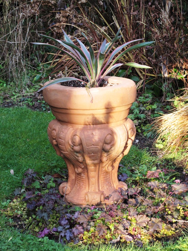
Here is a beautiful planter; once dreary gray concrete, it has been warmed up with a coating of terra cotta-colored Latex paint.

In the process, I learned something new about how to save drab, lifeless cast-stone (concrete) containers and garden ornamentation.

Read on for the simple steps

Marco Henry, a gifted artist, garden and interior designer and Venetian expert, hosted a little luncheon at his amazing home. We were joined by our mutual friend Darlene Huntington, one of my very first “sources” when I joined The Herald’s Home & Garden section in 2000.

Over the years, I have had the privilege of writing about both of these incredibly talented gardeners and their verdant, plant-filled environments. The two introduced me to other Snohomish County plant fanatics, owners of vintage homes, collectors of antiques and garden-makers. I have been so enriched as a writer and gardener from that 4-1/2-year episode of my life. 

After lunch we, of course, ventured out to Marco’s garden. Yes, it’s winter here in the Pacific Northwest, but when you have structural plants (such as Italian cypresses and ball-shaped boxwood shrubs), there’s lots to appreciate. When you see these elements, you understand what people mean when they say to design the “bones” of the garden for year-round interest.

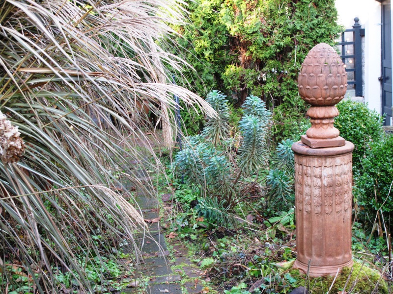
A simple coat of Terra Cotta pigment, from a can of Latex paint, transformed an old concrete pedestal and finial into a work of art.

I first wrote about Marco and his garden when it was included on the Northwest Perennial Alliance’s “Open Garden” tour  in 2000. Darlene marched me over to Mark’s home for an introduction. When I entered the Gothic-inspired wood gate, mounted into a niche in the beautifully-groomed hedgerow, I gasped and gazed in awe at what I saw inside: plant collections, art collections, vintage furniture, water features, sculpture and more – all surrounding a circa 1912 farmhouse and yard, complete with chicken coop and green house. 

This garden has the power to transport its viewer to a horticultural world we all yearn to possess. Is it a formal Italian garden? Or a cottage-style English estate? Maybe it’s a a landscape in the South of France. Each of these influences has a voice in Marco’s garden.

A teacher early in his career, Marco can be credited with giving a generation of fortunate kindergardeners an appreciation for art, color and beauty. Now, the grown-ups in his world can learn from his garden design techniques and his unique aesthetic.

My June 2000 article was called “Secret Garden.” I just unearthed that article and re-read it, savoring some of Marco’s choice quotes: 

“I’m a plant collector, a collector period. Some people put all of their collection together in one place. I don’t. I like to make something artistic out of it. 

“If I buy one of something I like, it’s the beginning of a collection. I could be Chinese porcelain or it could be coleus.” 

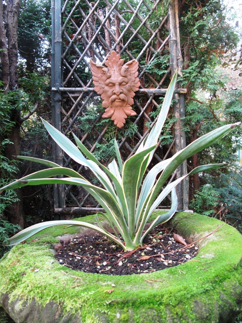
My eyes were drawn to the Green Man plaque, all the more noticeable now that he's been coated in Terra Cotta paint

Looks like original Terra Cotta, doesn't he?

In 2006, I was asked by Cottage Living magazine to again write about Marco’s garden. We had fun with that story, which was photographed by Richard Warren. I loved sharing Marco’s gardening style with a national readership, especially his tips on growing and designing with hydrangeas. 

Marco is passionate about Venice, a city he first visited in 1968 as a young man.  In a post-card written to his parents that year, he said he could imagine living in Venice. Now that dream is practically true, since Marco travels to Venice at least twice annually. He has guided many tours there for fans of Venetian architecture, art and gardens, and he lectures on the lessons we can learn from the gardens of Venice. 

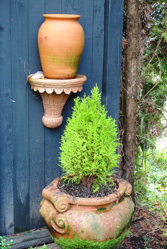
Today’s lesson was all about Terra Cotta and the way it can warm up a garden, especially ones here in the Pacific Northwest that exist under a grayish cloud cover all winter long. Marco showed me several ornamental pieces that began their lives as uninteresting blobs of concrete. Concrete, he says, often recedes and is visually obscured by the greenery around it. Now he’s infused these pieces with the sun-drenched character of Italy. It’s a simple process and one I’m eager to try myself:

The little Terra Cotta "shelf" was transformed from gray cast-stone concrete to rich Terra Cotta - with Latex paint!

1. Find a piece of broken Terra Cotta pottery or a flowerpot with the perfect red-pink shade you love.

2. Take it to the paint store and ask the guys to mix up a can of paint that matches your sample. Be sure to order exterior Latex (water base) paint.

3. Fill a plastic bucket with some of the paint and drizzle in a bit of water to dilute it to a consistency that’s easy to work with. It can be more like a glaze or a stain in thickness.

4. Start painting any old piece of ordinary garden concrete. You may wish to coat the concrete with one, two, or three coats. The water-base pigment will “take” to the concrete differently, depending on how porous it is. Marco says the Terra Cotta-colored paint definitely “soaks” into the pores of the concrete.

5. Finally, you will enjoy what looks like perfectly-cast Terra Cotta. It weathers nicely and may soon take on a patina of age, moss, or lichen.

You’ll be pleased with the resulting appearance of your efforts. Old concrete gets a Mediterranean-style upgrade – to classic Terra Cotta. How easy is that? Thank you, Marco – great tip!

POST-Script: Thanks to Jim Bishop of San Diego-based Bishop Garden Design, who originally saw this post on my Facebook page, I want to share his cool ideas for painting concrete:

If you want to give (terra cotta) an immediate aged look, get a second can of (paint) in a darker version of the first color.

Water this down too or add a glazing agent and paint lightly over the object especially in the recesses. Rub off the excess until you get the aged look you want. Oil based gel stains work well too for creating an aged look and give you a longer working time.

Get out that paint, people! Have some fun!

New Garden Products for 2011 – Part Two

Tuesday, November 30th, 2010

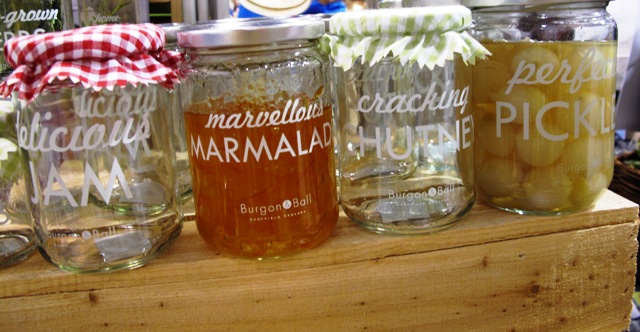
Preserve the Harvest with Burgon & Ball's charming jam, marmalade, pickles and chutney jars.

Trend-spotters are reading the horticultural tea leaves these days.

It’s an annual practice that I remember so well from my newsroom career when, without fail, we reporters were asked to compile the obligatory “forecast” story. I covered retail, and you could imagine how loathe Seattle’s major retail CEOs were to tell me anything about the coming year when it was just days after Christmas and they hadn’t tallied up the current year’s performance.

But, alas, we all want a glimpse into the future. And that’s what going to industry trade shows can help reveal. A peek into the products, plants, tools and design items you may be seeing in 2011’s backyards.

This post continues with even more interesting offerings. Or the ones that caught my interest anyway. I welcome your reaction. Are these items you can see yourself purchasing for your garden? Do you even NEED more products? (That’s a long conversation, isn’t it?).

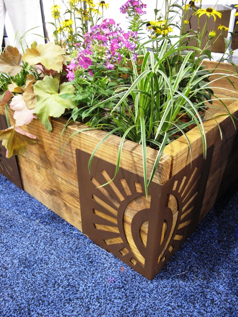
Here is the "sun" bracket from M Brace - simply brilliant!

I really enjoyed meeting Jill Plumb, a school teacher who came up with a brilliantly simple method of building raised beds.

Her product is called M Brace. It is a decorative steel corner bracket that holds lumber at a 45-degree angle WITHOUT HARDWARE (note: this is a big selling point for anyone who has dragged the electric drill and 100-foot-long orange extension cord out to the backyard to try and wrestle together a box for the tomatoes).

Here's Jill demonstrating the nifty packaging for a pair of brackets.

Jill told me that she got this “big idea” one day while re-loading paper napkins into a “slot” style napkin holder.

Something clicked and she saw in her mind’s eye how easy it would be to have a bracket that emulated that napkin holder. Just larger, more durable and also pretty. Several prototypes later, including the support of her students who she involved in the design process, packaging development and marketing, Jill’s M Brace is looking very professional and has already hit garden center shelves in some markets.

Made from recycled steel (natural or powder-coated), with decorative cut-outs including a squiggle, sun, carrot or bamboo fronds, the set of 4 brackets has a $165/set recommended retail price. Jill continues to offer new product ideas such as “edging” made from the leftover swirl pieces or plant stakes from the leftover carrot cutouts. Brilliant!

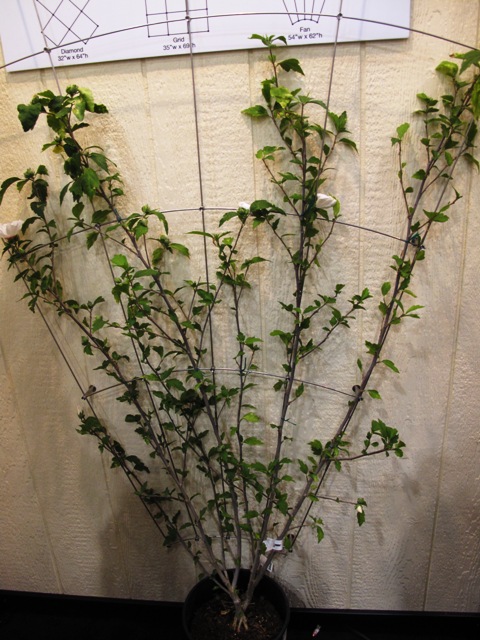
The Feeney 3-in-1 trellis, shown in a fan pattern

I spotted another clever system to corral plants – especially in this case, vines – in the Feeney Architectural Products booth.

A detail of the Somerset II Trellis

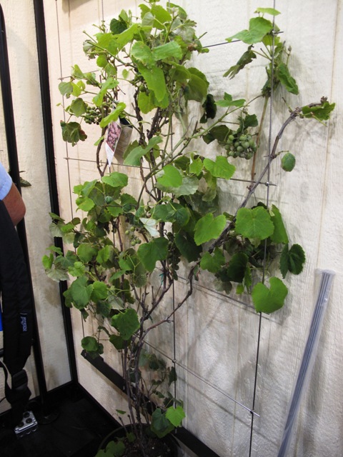
We see so much over-designed crap in the marketplace, which is one reason why I appreciated Feeney’s simple use of stainless steel cables to create a trellis for climbing plants. Feeney’s 3-in-1 Trellisis an easy-to-assemble wall-mount trellis kit with 1/8-inch diameter rods and special mounting components that can be configured into a Fan, Grid or Diamond design. This is a lightweight solution that does require measuring and drilling skills to install, but can turn a blah wall or fence into something quite beautiful. Just add a vine of your choice and voila! Something quite pretty. Suggested retail: $199.

Feeney also uses stainless steel cables in its inexpensive “It’s a Cinch” plant hanger and in a freestanding trellis panel kit. The Greenway Trellis has a frame of aluminum tubing and a square-grid pattern for the vines. The frame legs can be set in compacted gravel or concrete footings, or they can be base-mounted on a deck or patio. That square-grid pattern also shows up in the Somerset II Trellis, which has top and bottom powder-coated aluminum brackets. It is also a wall-mount system but a little larger than the 3-in-1.

READ MORE…

Meet the new generation of mums

Tuesday, November 23rd, 2010

Seatons Toffee, a 'quill' form with deep bronze petals.

I have great memories of the giant yellow chrysanthemum corsage my dad bought me for a college homecoming when I was a little girl. That curly ball of petals was so unwieldy it was hard to keep from crushing it with my chin. To me, that mum didn’t even feel real – it was like something from a fantasy world of my dreams.

My relationship with mums hasn’t really changed much since then. I’ve always kept them at arm’s length, both in garden design and in floral arranging.

The only time mums registered on my radar in the past decade was the celebrated arrival of ‘Kermit’, a lime green mum with a button-like flower that gained a huge following for its zesty color and knack for looking good in a vase for up to two weeks. But what about other mums?

Lots to learn

'Yoko Ono' is a top pompom-style mum with that awesome green hue.

Any ambivalence I’ve had about mums changed for the positive after I met two leading mum experts at the Association of Specialty Cut Flower Growers annual symposium in Tulsa, Oklahoma earlier this month.

On one of the long bus rides, I sat with Ray Gray of King’s Mums, an Oregon City, Ore.-based grower of “exhibition, specialty and vintage chrysanthemum rooted cuttings.”

Ray shared a bit of the story behind how he and his wife Kim purchased King’s Mums in 2008. The Grays are longtime wholesale nursery owners who were looking for ways to diversify their crops. They learned from Janet Foss, another grower, that King’s Mums was for sale.

'Yodogimi' is a semi-double mum with dark red petals tipped in gold.

For more than 40 years, the King family operated a huge Chrysanthemum-growing operation in Central California. The business served the amateur gardener and professional grower with more than 200 cultivars of exhibition and spray mums, one of the largest sources in the U.S.

After buying the business, Ray and Kim in January 2009 moved this amazing collection to their small family farm in Oregon City. They are carrying on the tradition begun by the Kings while also implementing new technologies and growing methods.

'Two Tone Pink' has petite pink-purple petals with white tips.

Ray gave me a copy of the King’s Mum catalog and right away I started drooling over the cultivars between the covers. As a cut flower choice, the mum is superb. The palette leans toward the warm end of the color spectrum, which is very en voguewith today’s floral designers: bronze, gold, terra cotta, salmon, champagne, orange, crimson, pink-red, lime green, apricot, burgundy, and all sorts of luscious bi-colored petal combinations. And of course, there are also pastel, cream and white flowers.

'Senkyo Kenshin' is a dark bronze 'spider' form - magical!

I know this is probably all old news to people in the National Chrysanthemum Society, and to specialty cut flower growers and their floral design clients. But I found it thrilling to meet Ray and learn how he and Kim are keeping alive this important cut flower category. Yes, I started to fantasize about growing some of these blooms in my own garden.

Note to self: King’s Mums is open to the public each October. Located about 20 minutes south of Portland (Oregon City is the end of the historic Oregon Trail), you can visit during business hours and see these yummy flowers up close and personal.

A beautiful punch of color comes from mums filling the hoop house at Bear Creek Farm.

There is another reason why mums stayed on my mind at the ASCFG conference. After meeting Ray and flipping through the beautiful flowers in his catalog, I was stunned to walk into one of Vicki Stamback’s hoop houses at Bear Creek Farms to discover rows of these very mums I’d just seen in that catalog.

I have to confess, I was a bit antisocial while skipping out of the demonstration of releasing beneficial insects in the greenhouse. But I wasn’t the only one climbing between the shoulder-high rows of mums, taking photos of these really superb blooms and making sure to jot down the name of each. These flowers were impossible to ignore as you can see here.

The following day, I sat in on “The Comeback of the Mum,” a presentation by Chehalis, Wash., grower Janet Foss. I learned enough to become a confirmed mum fanatic. You can read a summary of her presentation at A Fresh Bouquet.

I’ve got to share the rest of these incredible specimens:

A mini terrarium to hang from your tree boughs

Monday, November 22nd, 2010

Okay, I know that there is still one more week left in the month of November, but we had a big Seattle snowstorm today and so visions of sugarplums are dancing in my head.

One other reason I’m dreaming about my holiday decor is the just-arrived December issue of Better Homes & Gardens. It hit newsstands with a really gorgeous wreath on the cover and all sorts of design, entertaining and gift-giving ideas filling 275 beautiful pages.

A medium-sized glass "world" to gaze upon in wonder.

I was asked to pick my favorite garden gift for the holidays and you can read about it on page 153. Or you can see it here: An alluring “Forest Floor” ornament created by San Francisco designer Flora Grubb. It is a winner! Thanks to Flora for suggesting we feature one of her custom ornaments and for sharing the photograph you see here.

Living Ornaments:

It’s fun to use living elements and wild-gathered souvenirs from nature in your holiday decorating. I love this “Forest Floor” glass ornament created by San Francisco designer Flora Grubb. Lichens, moss, feathers and seeds cushion a living Tillandsia air plant inside a tiny glass ball – an enchanting, diminutive naturescape to hang from branch or bough.

An occasional spritz of water is all this tiny terrarium needs to continue looking beautiful – even after you take down the tree. Available from www.floragrubb.com; 3-inch, $19.95; 4-inch, $24.95; set of three 2-inch balls, $19.95.

Cool, huh?

Some good news for the print world:

For those of you who subscribe to the New York Times, you can’t have missed a full-page advertisement on the back of today’s Business section. It’s so huge that I couldn’t scan the entire contents of the colorful spread on my tiny printer. But here’s the gist of it:

Better Homes & Gardens, along with Meredith Corp. sister title Family Circle, are the magazine world’s #1 and #2 top books for women consumers, in terms of total advertising pages sold.

Under the leadership of editor-in-chief Gayle Goodson Butler and SVP, Group Publisher James T. Carr, Better Homes & Gardens has earned the support of 1,739 advertising pages this year. 

Just when everyone thinks magazines are a dying breed, here’s a report that “these magazines have held the top two positions in the women’s lifestyle category for 2010 and 2009.”

Just sayin’.

A tour of the Chartreuse House garden

Saturday, November 20th, 2010

You can't miss the Chartreuse House, seen through the similarly-colored plant palette.

Today’s Los Angeles Times’ HOME section features my architecture/interiors story about Lisa Little and Phil Brennan’s makeover of a pair of tiny cottages in Venice, Calif.

The Venice-based architect and her special effects wizard husband painted the exterior an acid-chartreuse color and trimmed the house in charcoal gray.

Click on over to the story and you’ll see a fabulous web gallery of images shot by photographer Katie Falkenberg.

I also included a sidebar on Stephanie Bartron’s amazing work in the postage stamp-sized front yard, which faces a Venice walk street, which appears in LA at Home, the Home section’s daily design blog.

But you really can’t see much of the garden in the Times’ web gallery.

I promise you – it’s something to behold, featuring a dazzling palette of plants that enliven the small entry garden and play beautifully with the rugged materials Stephanie selected.

So I will share those photos here, along with the sidebar text:

A Chartreuse garden

As a color-packed accent to the renovated 1905 Craftsman bungalow, the Chartreuse House’s front yard is a example of how much great design can occur in a tiny patch of soil.

Yet before choosing a zesty palette of drought- and salt-tolerant plantings, designer Stephanie Bartron, of SB Garden Design, had to address some of the less visible challenges of the property’s postage stamp-sized entry. Prior owners had piled layers of topsoil over the sandy native soil, which created a drainage mess.

A wave-like pattern gives lots more interest to the raised bed.

“I needed to lower the grade of the front yard in order to move water away from the house,” Bartron says. “We calculated the volume of soil to excavate and used that amount to fill two raised planters. That way we didn’t have to haul away any material.”

Divided by a permeable walkway of concrete tile, the raised planters are formed by boxes of thick steel plate that have been roughly finished to encourage rusting. Now weathered, the boxed-beds replicate the Cor-Ten steel used to make the vertical planter in Little and Brennan’s courtyard.

The same weathered steel forms a slender raised planter at the base of the charcoal fence facing the walk-street. It is filled with a ribbon of golden oregano and Sedum rupestre ‘Angelina’ — which dazzle against the darker fencing.

The chartreuse scheme continues outside the gray composite fence.

Bartron asked the metal fabricator cut a “wave” detail along the top of the larger planting box and in it she installed a sedge meadow, a nod to the nearby beach.  Privacy screening comes from a “hedge” of weeping Mexican bamboo and alternating chartreuse and yellow-flowering kangaroo paws.

“The plants create a punch of color in  such a small space,” Bartron says. The lacy bamboo fronds, the tall kangaroo paw stalks and the undulating drifts of sedge are constantly moving, thanks to the ocean breezes. Little added a eucalyptus tree to the front area, situated so that it will eventually grow high enough to screen the house’s topmost windows.

Such a simple yet sophisticated combination of plants in the smaller of two raised beds.

For the smaller of the two planter boxes, Barton paired dramatic clumps of smooth agave (Agave attenuata), known for growing well near the ocean, with Mexican feather grasses, dark purple Aeonium arboreum ‘Zwartkop’ and yellow-and-green variegated New Zealand flaxes. The entire bed is under-planted with the chartreuse Sedum rupestre ‘Angelina’. Filled with detail, it is a diminutive landscape that causes visitors to slow down and experience while approaching the front door.

The garden has many sustainable features, including low-maintenance plantings and permeable surfaces. Yet, says Bartron, its main design motivation is a response to the architecture. “This is such an artsy, whimsical place and I see the garden as a colorful jewel box for Lisa and Paul to enjoy.”

–Debra Prinzing

I’ll close with just a few more photos:

The larger of the two raised beds is planted mostly with Carex, to emulate the waves of the nearby Pacific Ocean.

This view shows how the Mexican bamboo and the kangaroo paws provide ample screening from the walk street traffic.

Playful and suitable for the setting, the lemon yellow kangaroo paw sways in the breezes.

Sunday in the park with Debra

Saturday, November 6th, 2010

Dahlia 'Duo'

Last Sunday morning, while staying a few extra days in San Francisco after my Garden Conservancy talk, I took two Muni buses (47 & 5) to Golden Gate Park where all things artistic, botanical and cultural seem to reside.

My objective was to see the amazing living roof at the California Academy of Sciences, but once I realized I only had 90 minutes, my plans took a slight detour. Art and flowers beckoned.

The Conservatory of Flowers, with Dahlia Dell in the foreground

First stop was the Conservatory of Flowers, circa 1879. It is one of the last remaining Victorian-era conservatories on the West coast (the other resides in Seattle’s Volunteer Park). Before I could even approach the conservatory, my attention was diverted by a late autumn display of dahlias.

Called “Dahlia Dell” and dating to 1924, two demonstration flower beds thrive here, located to the east of the conservatory. They are maintained by volunteers from the San Francisco Dahlia Society for the simple purpose of educating local gardeners and flower lovers about the diversity of dahlia color, form, size and culture. I have a feeling that Paula Jaffe, a dahlia expert and educator who I profiled in “Dazzling Dahlias,” a 2008 Perennials magazine article, is one of the passionate individuals responsible for this joy-inducing floral display.

It was fun to play around with the “tulip” Macro button on the back of my Canon G10 camera and take pics of the fading beauties. These dahlias have withstood the combination of late-season rain, fog and sunshine and they’re still producing pretty blooms. I can’t wait to grow dahlias again, especially because they play well with flower vases. Really well. Enjoy this diverse display. Most (but not all) of the plants were labeled, thankfully.

Dahlia 'Western Spanish Dancer'

Dahlia 'The Phantom'

Dahlia 'Sir Richard'

Dahlia 'Shipley Spot'

Dahlia 'Shea's Rainbow'

Aptly named: Dahlia 'Pooh'

Dahlia 'Pink Paradise'

Dahlia 'Horse Feathers'

Dahlia 'Green D'Or' orange sport

Dahlia 'George C'

Dahlia 'Elvira' (a miniature)

Dahlia 'Delta Red'

Dahlia 'Creamy Beige'

Dahlia 'Bo De O'

Dahlia 'Belle Fiore'

Dahlia 'Badger Twinkle'

Dahlia 'Arulen Princess'

MORE TO SEE

The de Young's tower - against a blue autumn sky.

After spending an hour with the dahlias, I moseyed over to the California Academy of Sciences, but discovered that – from ground level – it is nearly impossible to see, let alone get a sense of its scale and magnificence, Renzo Piano’s green living roof.

So I compromised and spent my museum admission budget to enterthe de Young art museum where “Van Gogh, Gauguin, Cezanne and Beyond: Post-Impressionist Masterpieces from the Musee d’Orsay” was in full swing. It was exciting to see the many amazing and exciting canvasses on display. I’ve been to the Musee d’Orsay twice before when in Paris and so I enjoyed revisiting some of the paintings and drawings again. Twelve galleries of paintings were incredible to take in. You can never have too much of this artwork. The show continues through January 18, 2011.

Here's a closer look at the pointillistic-style perforated copper exterior.

After I left the galleries, I took the elevator to the viewing tower.

Actually, this was the first time I’ve been to the de Young since it was renovated and reopened in October 2005. The “new” building is clad in a perforated copper sheath, which may sound rigid but has a sensual fluidity that reacts to the light and dark.

Depending on how the sun moves through the sky, the building’s surface has dot-like patterns and a shimmery quality. The 144-foot tower is one of the most alluring aspects of the new design, by Swiss architecture firm Herzog & de Meuron and Fong & Chan Architects in San Francisco. From way up high, you can see the best of San Francisco – a 360-degree, mind-blowing perspective.

This roof is incredible - a horticultural masterpiece on top of the California Academy of Sciences in SF

A closer look of one of the roof's mounded forms

From here, I got some photographs of that green, living roof.

 I’ve already decided that on my next visit to San Francisco, I will have to see that installation up close and personal. Because while peering down on it and photographing it (through the glass-walled viewing gallery), I noticed that people were up on the roof doing just that.

Not a bad lineup for a few hours at Golden Gate Park, huh?