February 22nd, 2014
Last summer I created a fun video with my awesome AV expert Hannah Holtgeerts of HHCreates. When I found out she had planned a visit to Seattle and would be staying with us for a few days, I asked if I could commission her to film and edit a floral how-to video. Lucky for me, Hannah said “yes.”
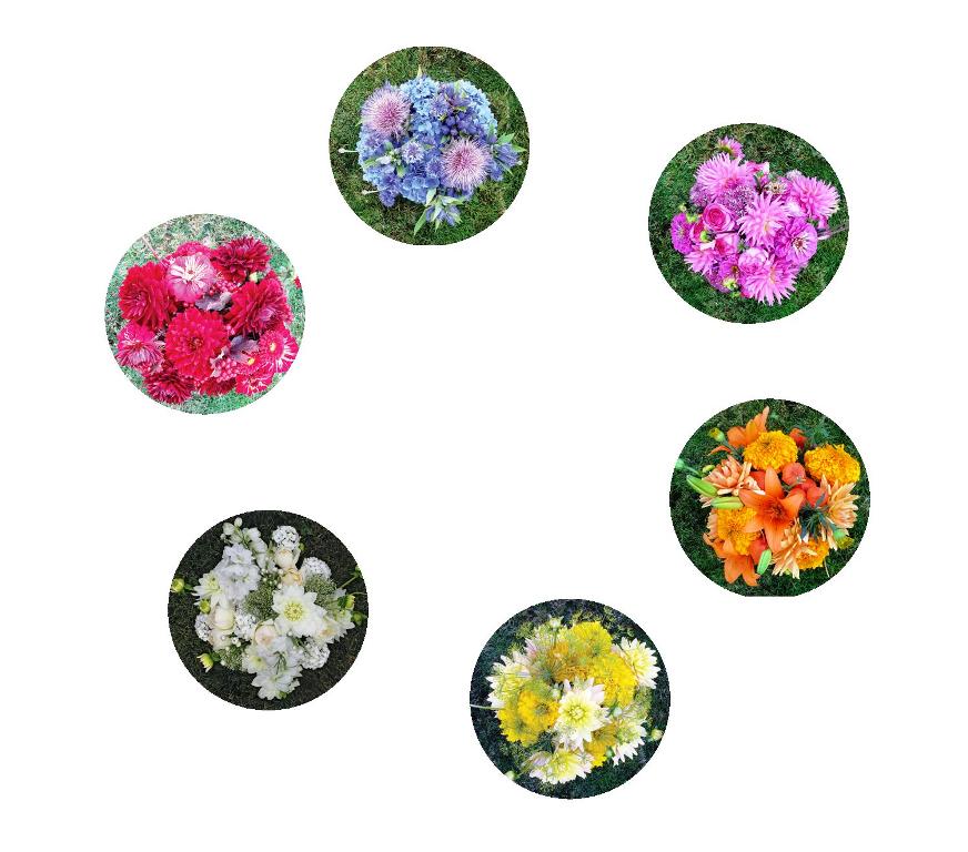
We came up with the idea of a Floral Color Wheel and created this fun piece below. The inspiration for this video originated with Nicole Cordier Walquist of Cordier Botanical Art, an award-winning floral designer and artist whose color-themed bouquets appear in Slow Flowers. You can see her primary- and secondary-inspired bouquets in the video’s cute animated color wheel.
So we created the video last summer and then I asked Lola Honeybone of Media Workshop Nashville (the world’s best publicist) to help me promote the video.
 Lola and her colleague Marla spread the word and many media outlets picked it up and posted it on their web sites.
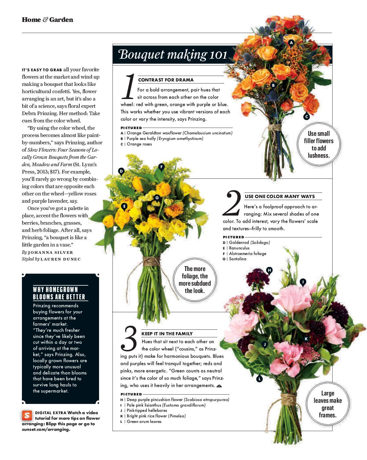
One of the publications that noticed was Sunset magazine, where garden editor Kathleen Brenzel and associate garden editor Johanna Silver were inspired to pursue the floral color wheel as a potential article.
By November, Johanna emailed to say: “Flower wheel got bumped into its OWN story (rather than just a blurb) for March. I might need to interview you for some more tidbits!”
I’m so grateful that they gave me the credit for the idea and featured me as the “floral pro” in the new article – out today in Sunset’s March 2014 issue. Sunset’s garden design assistant Lauren Dunec did a great job styling the floral elements for the story you see below.
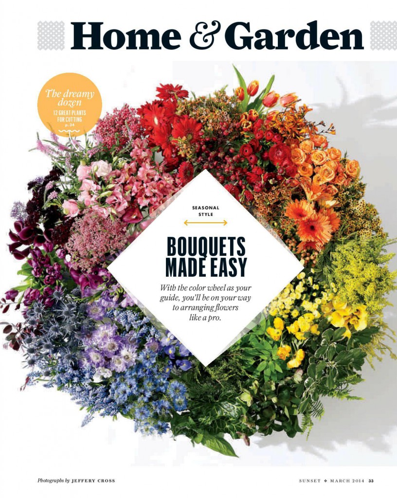

ALL ABOUT THE (FLORAL) COLOR WHEEL (adapted from Slow Flowers)
R-O-Y-G-B-I-V. Almost everyone remembers learning about rainbows and prisms in elementary school, right? Red-Orange-Yellow-Green-Blue-Indigo-Violet: the seven bands of the rainbow; the result of rain + sun in the sky.
These hues are represented by both the artist’s color wheel and the diversity of nature’s flora. There is an endless variety of flowers and foliage available to the gardener and the floral designer alike. But sometimes, when you’re at the flower stand or even walking through the garden, those beautiful choices can be overwhelming.
The Floral Color Wheel helps simplify and organize your design process, guiding you to create harmonious, eye-pleasing arrangements, centerpieces and bouquets, using a fun, paint-by-number approach (or shall we say “paint-by-petal”)?
Let’s call it the Floral Color Wheel
I use all parts of a plant to guide my color choices: Flowers and buds, of course. But also the stems, leaves, pods and berries. And then there’s the selection of vase color, another important variable.
When I teach floral students, I tell them that the color wheel is often the most essential tool in a designer’s toolbox. Knowing the basics: Primary and Secondary colors, and how they relate to each other, is a good starting point. Tertiary colors are the connectors that bring together otherwise disharmonious colors. See the glossary of terms at the end of this post for specifics about each term.
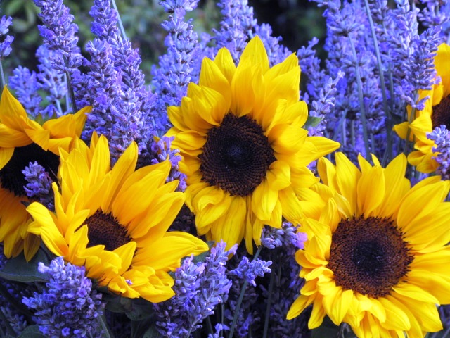
Yellow & Purple – a perfect complement.
Thank You For the Complement (above)
There are so many ways to create visual poetry with flowers. You want to express dramatic or intense emotions? Go for high contrast with complementary colors. Red and Green are across each other on the color wheel, and that’s why they’re called complementary. In the floral world, that might be reinterpreted as maroon with lime – imagine how gorgeous that combo could look! Orange and blue might morph into peach and teal (a very popular wedding palette these days). Yellow and purple can be a zinger in the vase. One of my all-time favorite summer bouquets pairs fresh-cut French lavender with field-grown sunflowers – a purple and yellow bouquet that is the perfect example of complementary design.
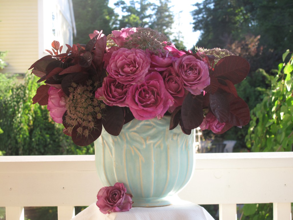
Analogous color palette of pinks, mauves and purples!
Let’s Be Friends: Analogous (above)
Neighboring colors on the wheel share many common pigments, which gives the floral designer clues as to how well they might look together in a vase. In landscape design, you often hear the term “cool” garden or “warm” garden – and essentially these terms describe the two sides of a color wheel. Cool colors with blue undertones include blues, greens, purples and pinks. Warm colors have red undertones ranging from yellow and orange to red and those yummy coral/peach hues. The mood created by analogous floral palettes can be anything from soothing and serene to high-voltage excitement.
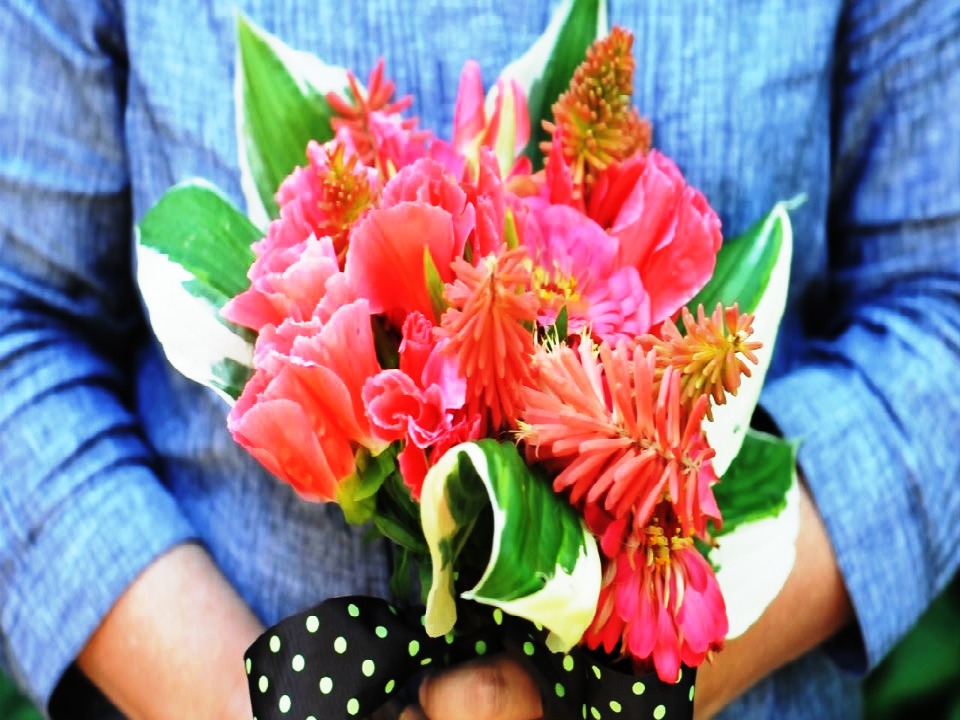
Three types of coral flowers – a Monochromatic bouquet.
Monochromatic is anything but boring
Out of flowers? Short on funds? That’s when a monochromatic bouquet of all foliage comes to the rescue. Gardeners and florists use the term “greenery” all the time – it’s nature’s neutral shade. But thanks to so many amazing textures, shapes and sizes of foliage, you can pull together a monochromatic foliage bouquet with ease — your clippers and a walk through the backyard make it easy. The result? A totally unexpected, thoroughly contemporary look. You can try this technique with any color foliage or flowers – or a combination of both. I created a small but sweet arrangement using a dark-burgundy aeonium (a succulent) and dark purple potato vine. Two completely different plants; same color. Eye-catching design.
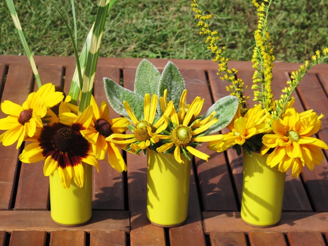
Another way to express a singular color.
I recently designed a fun, monochromatic project involving three yellow tumblers, each of which holds different varieties of black-eyed Susan flowers (Rudbeckia sp.) and textural foliage. This type of design allows you to clip bits of this and that from the garden and end up with a cohesive design – thanks to the unifying color theme.
A Botanical Rainbow
Nature’s stems, buds, petals and leaves make up the floral color wheel. It’s easy to incorporate these elements in your centerpieces and bouquets using complementary, analogous and monochromatic pairings. Be inspired by this timeless approach to color. But don’t feel restricted by color “rules.”They are only guidelines, worth breaking. Harold Piercy, principal of the Constance Spry Flower School in England, wrote in 1983: “…in flower arrangement, I have always found it advisable to discard any preconceptions about colours.” He added: “Keep an open mind and do not be ruled by the colour wheel. You may hit upon unexpected satisfactory results during your experiments.”
Glossary of color terms
Primary: These pure colors include Red, Yellow and Blue
Secondary: Combinations of two primary colors, including Orange (Red + Yellow), Green (Blue + Yellow) and Purple (Red + Blue)
Tertiary: A combination of one primary color and one secondary color
Complementary/Contrasting: Color “pairs” that reside opposite each other on the color wheel
Analogous: Adjacent colors on the color wheel, related to a dominant primary hue
Monochromatic: A single hue, or variations of one color, including tints, shades and tones
This entry was posted
on Saturday, February 22nd, 2014 at 8:59 pm and is filed under American Grown, Blog Posts, Creativity, floral design, General, Plants, Writing.
You can follow any responses to this entry through the RSS 2.0 feed.
You can leave a response, or trackback from your own site.


February 23rd, 2014 at 12:11 am
A wonderful piece in preparation for spring. I’m seeing forsythia and daffodils in my future!